
Transforming Riot’s legacy shopping experience for better usability and multi-game support
Project at a Glance
Timeline
Jun 2022 - Sep 2022
Tool
Figma, Adobe Illustrator
Heat Map
My Role
User Research
Hi-fi Design
Design System
Design QA
Team
UX Designer
Product Manager
Visual Designer
Software Engineer
Riot Shop is an e-commerce platform with 10M+ users, where players can buy League of Legends products without logging into the game.I led the redesign of the product detail pages with a scalable, intuitive interface that supports multiple game contents.
Through surveys and follow-up user interviews, content that mattered most to users was prioritized and brought into the final design. By reaching out to the Valorant marketing team, assets were aligned to create brand-new templates that support Valorant products in Riot Shop
Ultimately, research insights and business goals were translated into a redesigned product detail page that supports 4 games and 100+ products, delivering a more engaging and seamless shopping experience in Riot Shop.

Project Overview
Context
Riot Shop is an e-commerce platform with over 10M users, allowing players to purchase League of Legends (LoL) products without logging into the game. As a UX/UI Design Intern, I redesigned the product detail page to support the addition of two more Riot games by developing a scalable, intuitive interface that adapts to multiple game contexts
Outcome
User testing revealed an 88% satisfaction rate with the redesigned product pages, confirming a more engaging and intuitive shopping experience.
15 UI components were developed to support 4 games and 100+ products across the platform.
Scalable design foundations were established that align with the Riot’s shop future roadmap and business growth plans.
Design Process
Product auditing
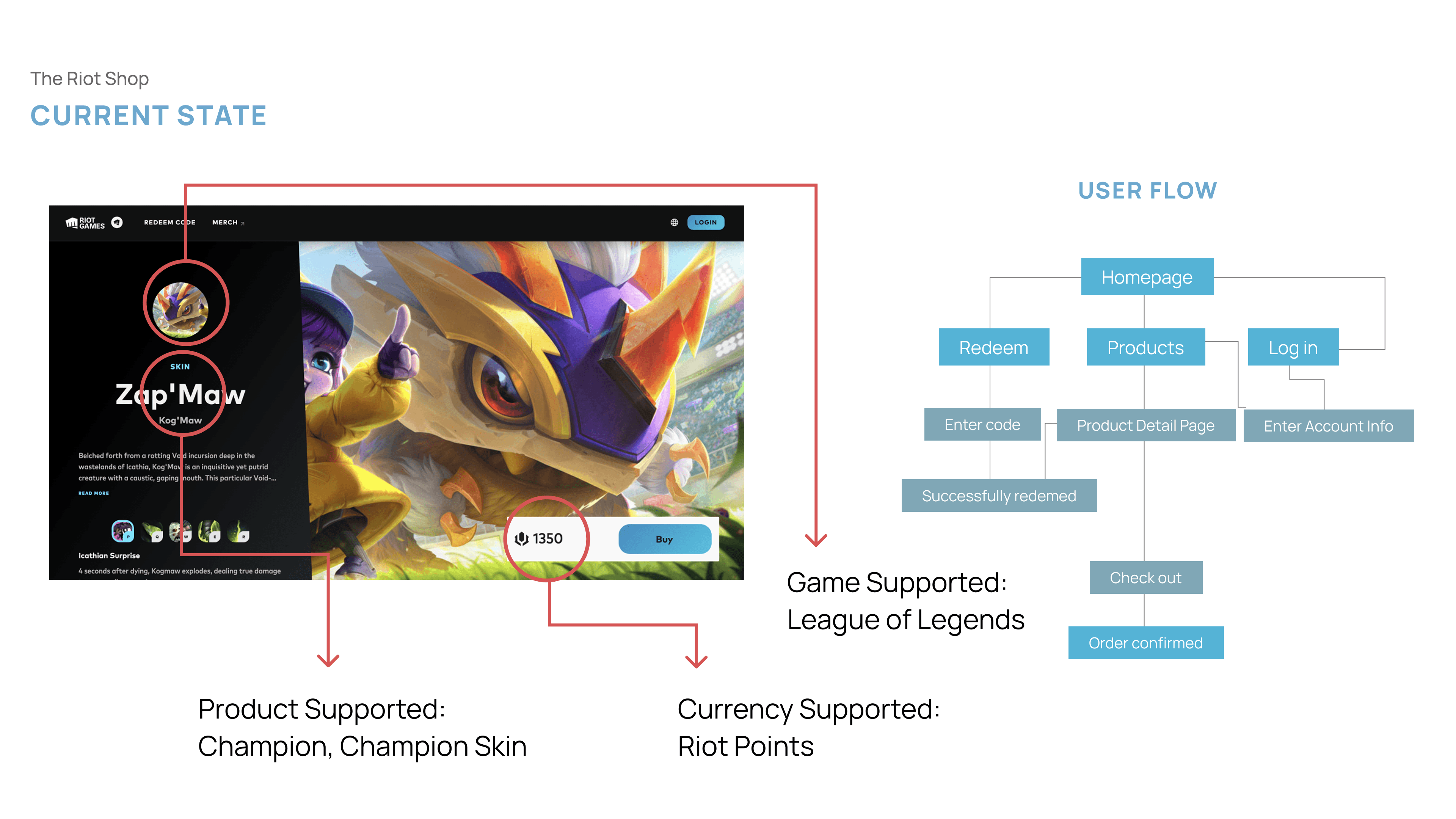
Current State
Currently, Riot Shop only offers champions and skins for League of Legends players. Users can view detailed item information such as product description, abilities diagram and on the product detail page to help them decide whether to purchase without logging into the game.
Problems to be sloved
Heatmap analysis suggested legibility issues that caused user confusion and disrupted the purchasing flow.
Click-through rate data shows that users rarely engage with the 'Read More' button, indicating a potential information delivery gap.
Inconsistent UI language and weak information hierarchy contribute to a poor visual experience

Research
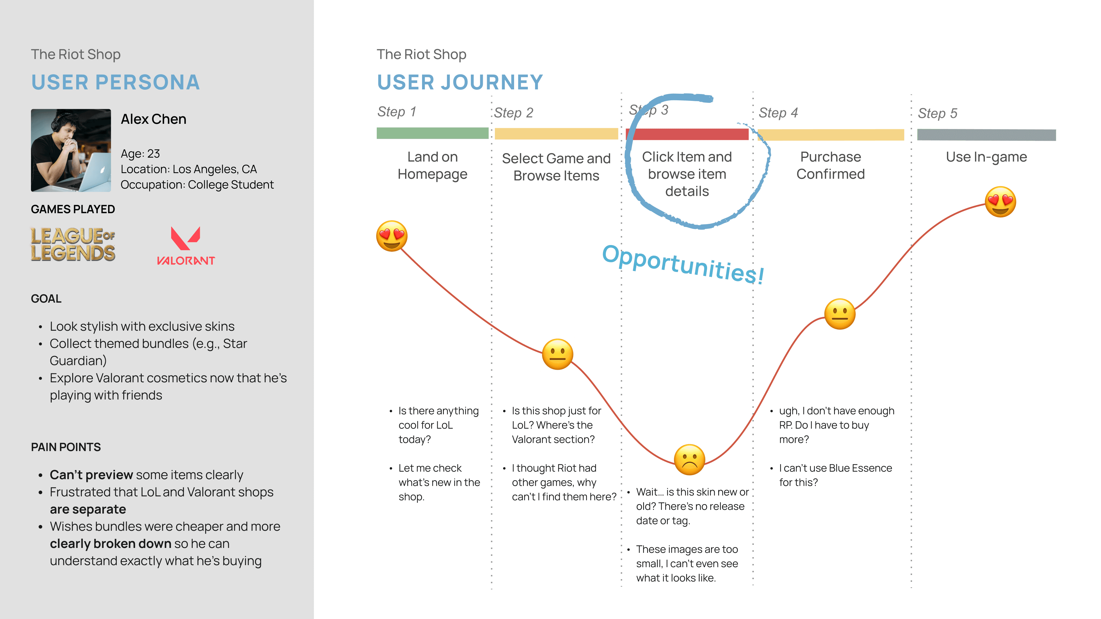
User Personas & User Journey
Through the auditing, we noticed a lack of clarity in content. By developing the user persona and mapping the user journey, we identified a high risk of insufficient information delivery.
Survey
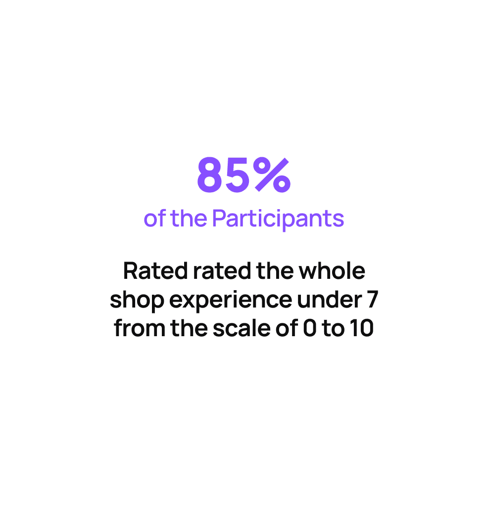
To address this, we decided to conduct quantitative research by sending out a survey to previous users to understand their preferences regarding product information.
According to the survey results, 85% of participants rated the whole shop experience under 7 from the scale of 0 to 10, and 77% expected more video content and product recommendations to help them decide whether to make a purchase.

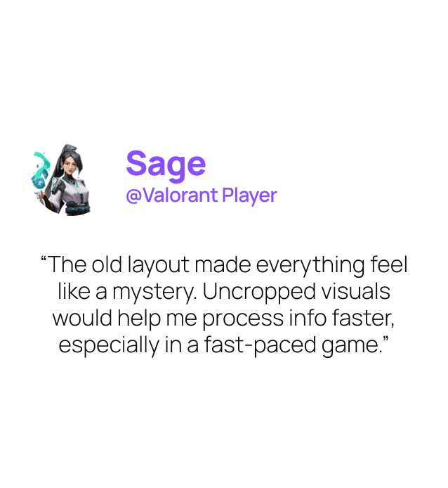
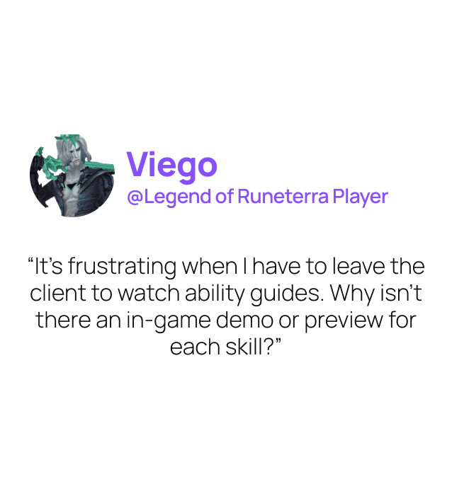
User Interviews
We conducted 6 follow-up user interviews to validate and deepen our understanding of the survey findings. Here’s what the users said:

Design Principles
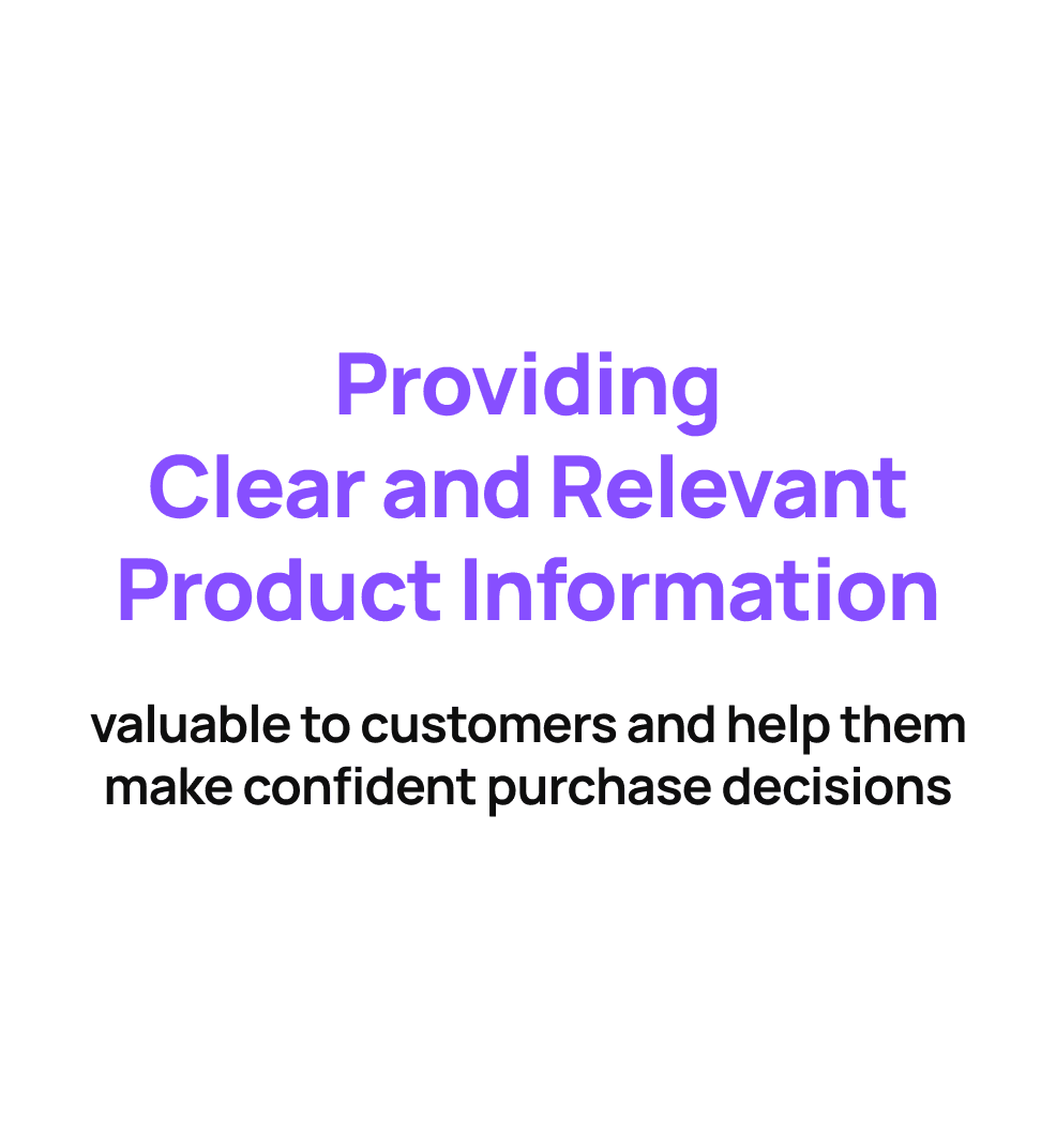
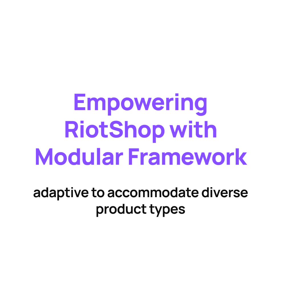
Based on the Product Auditing and Research findings, we establish two design principles and move forward to ideation phase.
Ideation
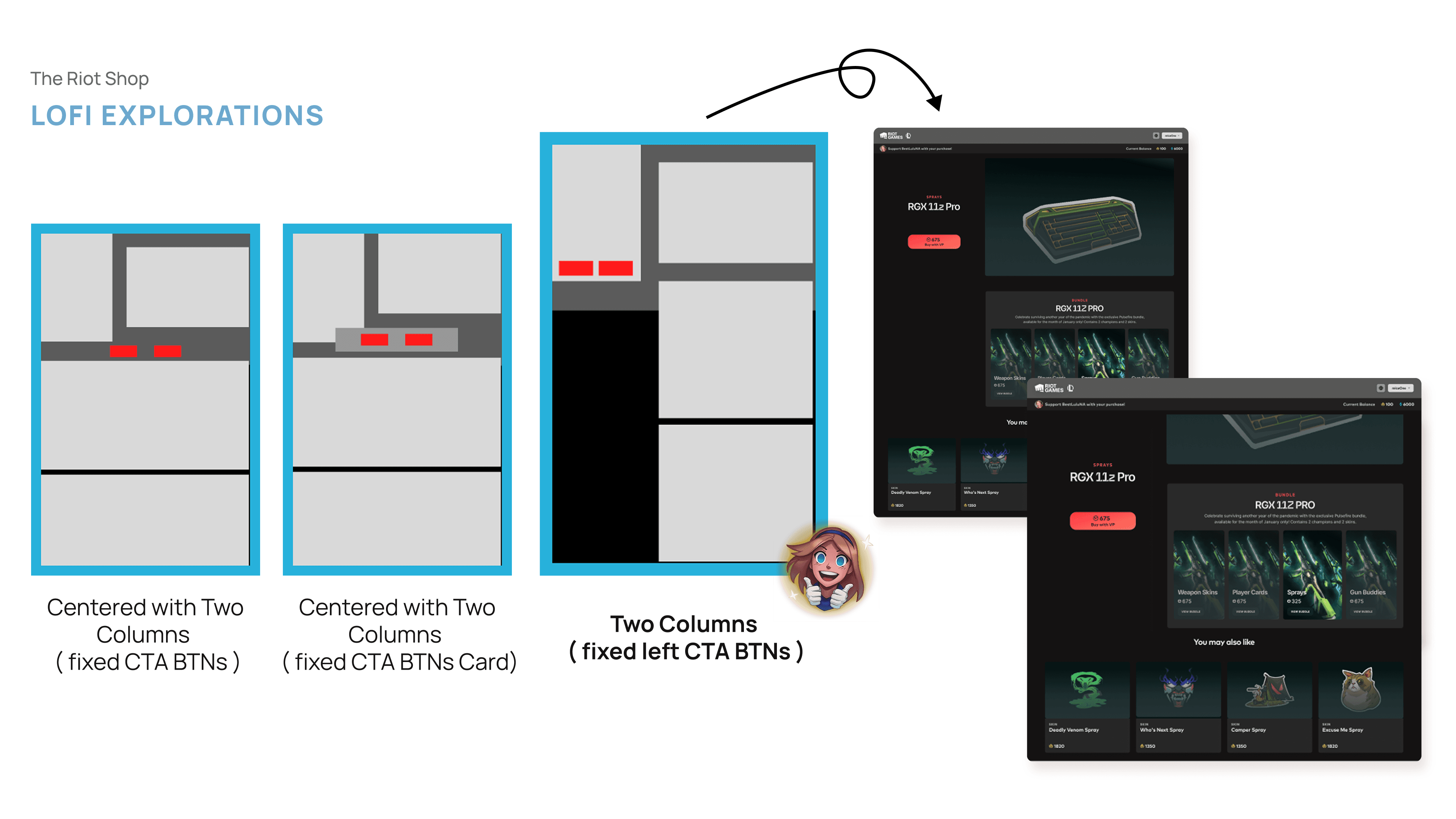
Low-fi Exploration
We explored three different layout design options. Option 3 stood out for its ability to continuously expose users to content through seamless vertical scrolling
Iterations
Champion Attributes
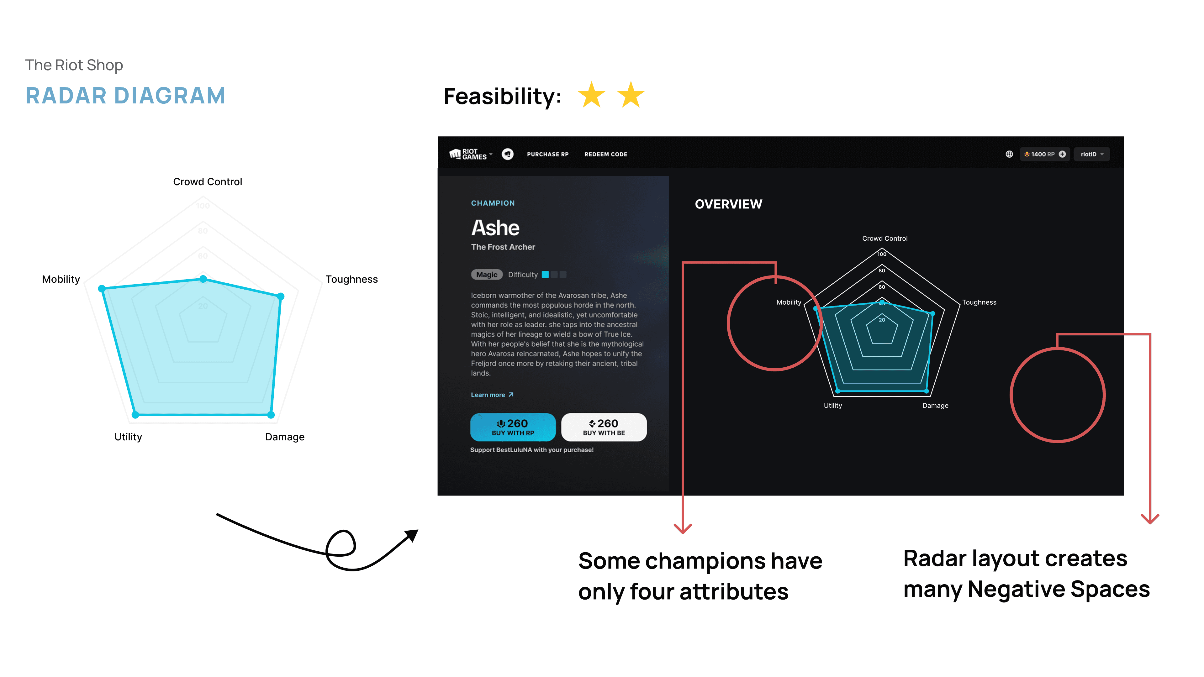
Radar Diagram
A radar chart is useful for efficiently comparing multiple champions’ attributes. However, behavioral analysis shows that players prefer to view a static page rather than navigate between multiple pages for comparisons. Additionally, since some champions have only four attributes, the radar chart may not be the most suitable visualization.
Attributes Overview
Following core design principles, a modular Attributes Overview was created to ensure clarity and scalability. In-game icons were used to maintain design consistency while rough percentages were represented by a circular indicator to prevent overwhelming players with excessive information. Precise percentages and support tips are shown on hover, providing additional details only when needed.
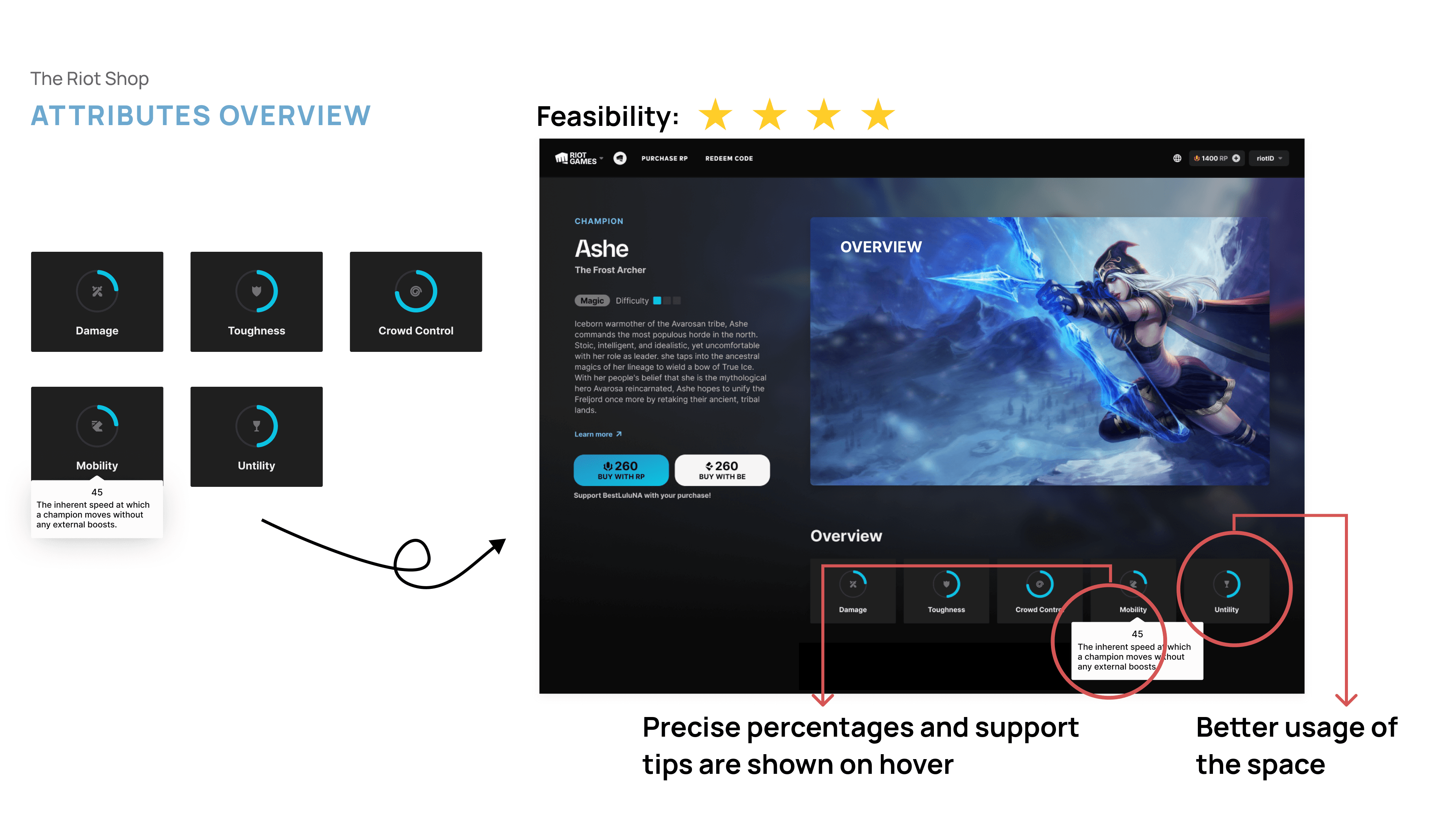
The Attributes Overview was chosen for its adaptability to different attribute counts and its step-by-step approach to presenting product information.
Ability Tab
Vertical Ability Tab
Vertical scrolling aligns with the page's natural scroll direction. However, vertical reading could disrupt the reading flow and potentially confuse users.
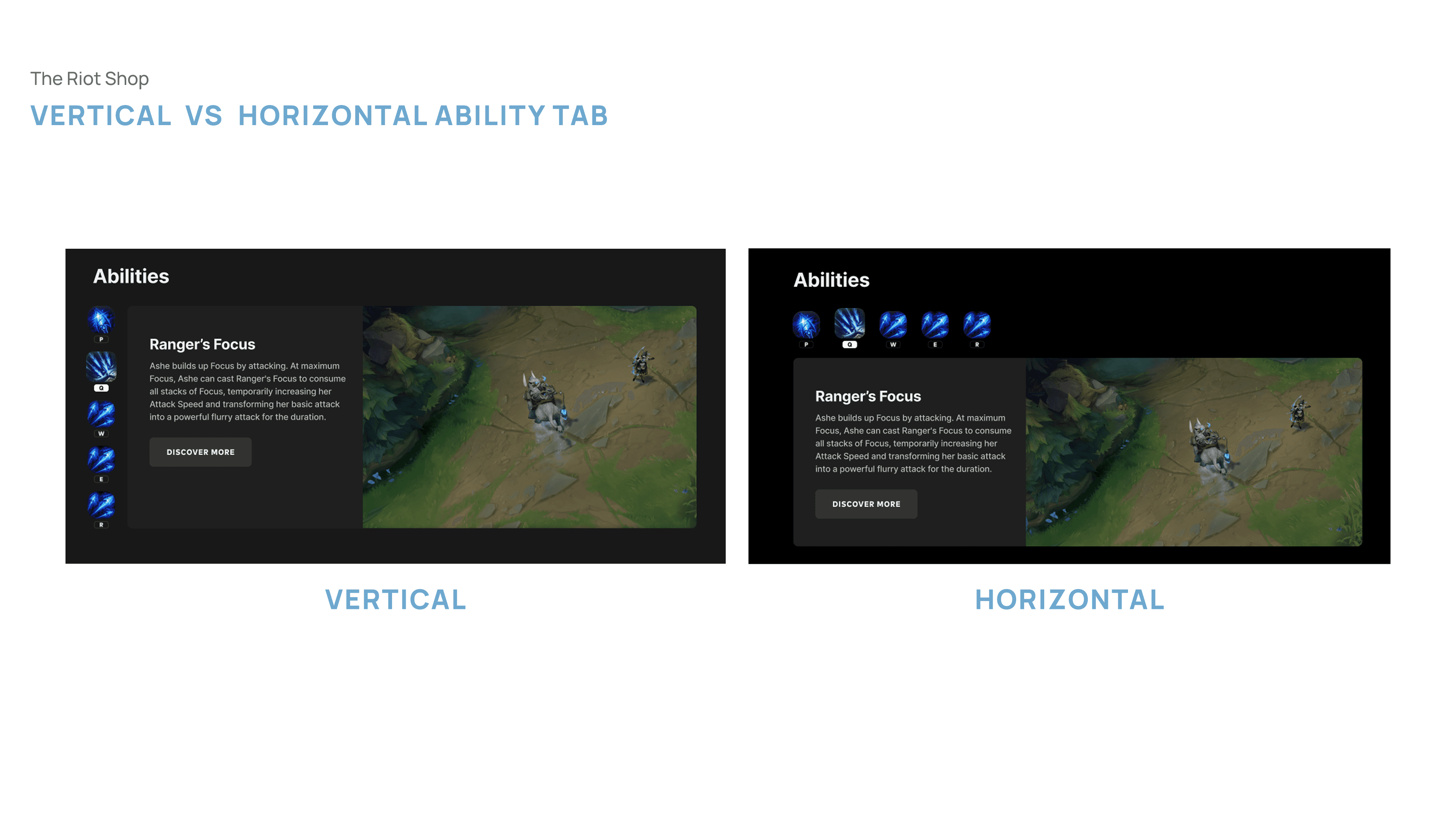
Horizontal Ability Tab
The tab was designed to group the five abilities in a way that creates a clear visual hierarchy, while also saving space and preventing endless scrolling.
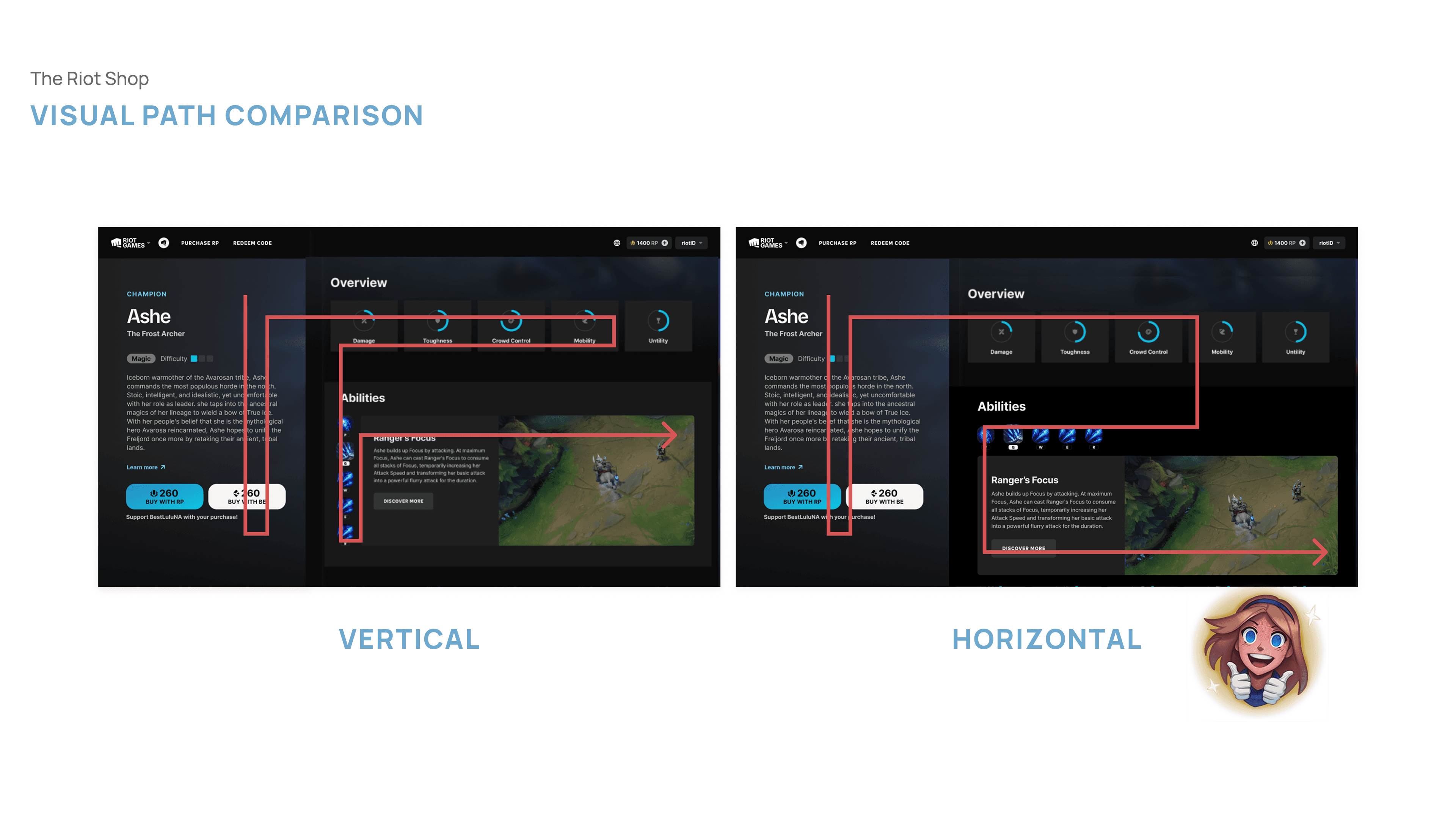
Finally we landed on the Horizontal design which enhances usability and keeps the experience intuitive.
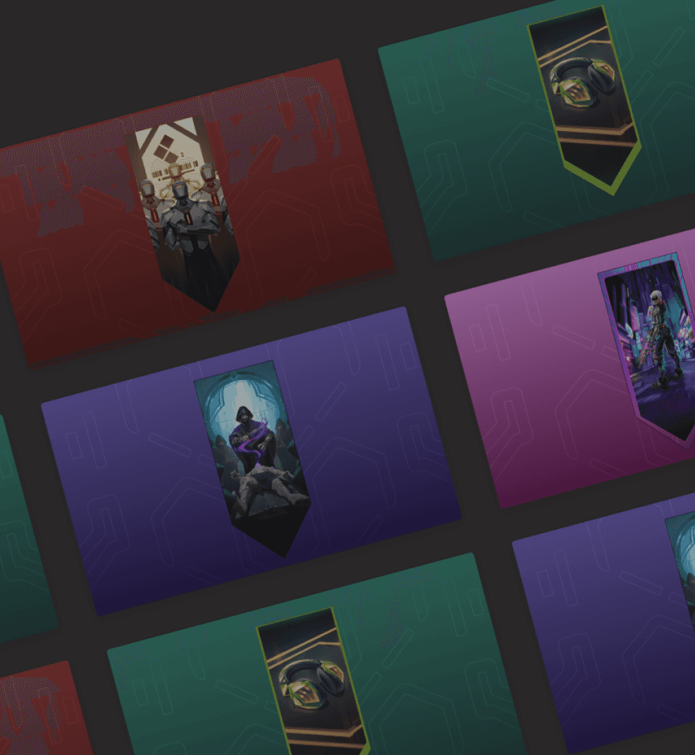
Design Template for Valorant
I took the initiative to develop visual patterns and color principles, establishing a design template for Valorant product images to ensure a consistent and cohesive visual language.

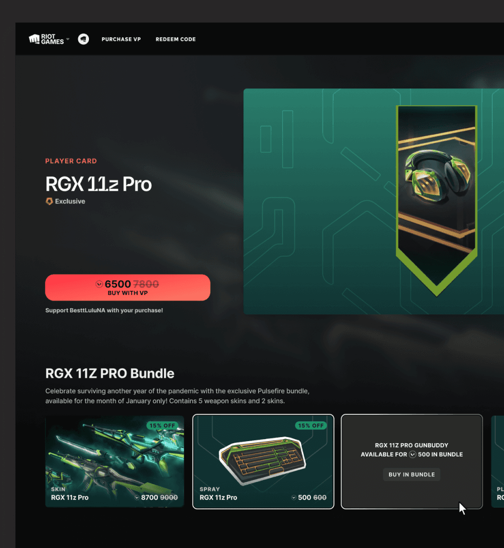
Bundle Promotion
Research findings indicated a strong user interest in browsing bundle offers to get better pricing. To meet this need, a bundle promotion featuring the currently viewed items was placed below the hero product image.
The first version included CTA buttons with pricing to encourage exploration and conversion. However, in the user testing section, player was confused by the multiple buttons and price tags.
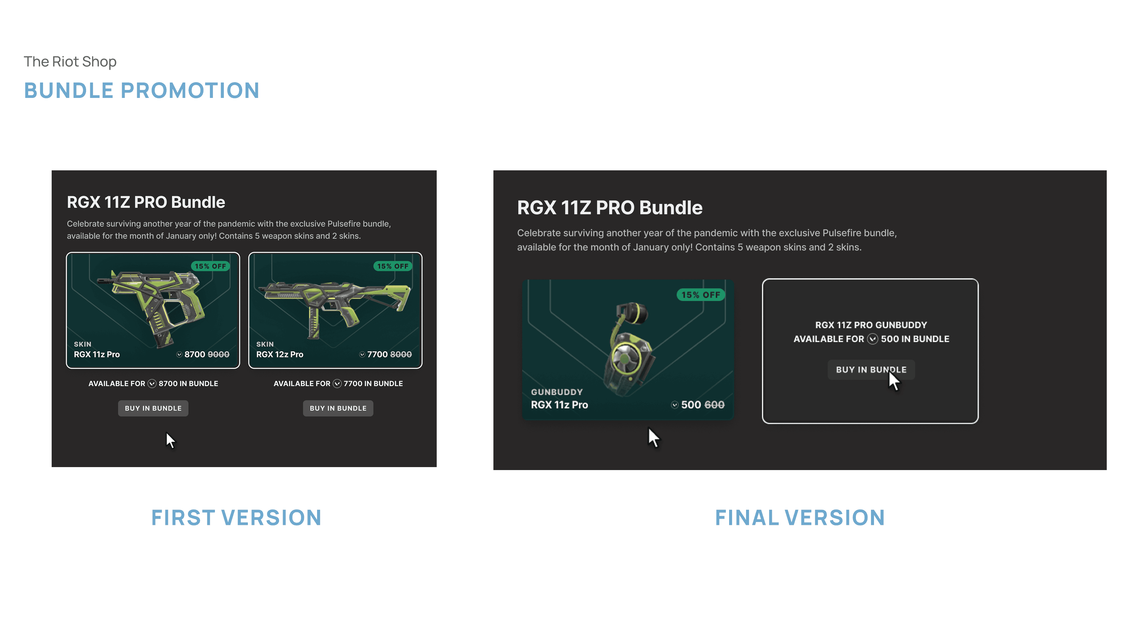
Building on the interaction pattern from the Attributes Overview, a hover-triggered UI card was introduced to improve clarity and reduce friction in the second version. It surfaces bundle purchase CTA buttons and pricing only when relevant, keeping the interface clean while supporting user decision-making.
Final Deliverables
Prootyping
League of Legends
The upgraded product detail pages were designed to fill information delivery gaps and provide a wide range of in-game content, enabling players to make more confident purchase decisions and enjoy a smoother shopping experience.
Valorant
Both bundle and individual item product detail pages were designed and implemented in the Riot Shop, allowing users to discover more affordable bundle options while browsing individual items. This enhanced the shopping experience for players, expanded product visibility, and supported broader business sales goals.

Outcome
User testing revealed an 88% satisfaction rate with the redesigned product pages, confirming a more engaging and intuitive shopping experience.
15 UI components were developed to support 4 games and 100+ products across the platform.
Scalable design foundations were established that align with the Riot’s shop future roadmap and business growth plans.
Learnings
One key lesson I learned from this project was the importance of fully understanding the product before trying to improve it. Gaining sufficient context early on helps designers build a clear mental model and identify potential issues. A closer look at user data can then validate assumptions made during earlier research. With tools like heatmaps and Optimal Workshop, data can be translated into actionable insights that inform design principles and guide ideation. Additionally, building a comprehensive and up-to-date product resource helps ensure the entire team stays aligned and informed.
Transforming Riot’s legacy shopping experience for better usability and multi-game support
Riot Shop is an e-commerce platform with 10M+ users, where players can buy League of Legends products without logging into the game.I led the redesign of the product detail pages with a scalable, intuitive interface that supports multiple game contents.
Through surveys and follow-up user interviews, content that mattered most to users was prioritized and brought into the final design. By reaching out to the Valorant marketing team, assets were aligned to create brand-new templates that support Valorant products in Riot Shop
Ultimately, research insights and business goals were translated into a redesigned product detail page that supports 4 games and 100+ products, delivering a more engaging and seamless shopping experience in Riot Shop.
My Role
User Research
Hi-fi Design
Design System
Design QA
Timeline
Jun 2022 - Sep 2022
Tool
Figma, Adobe Illustrator
Heat Map
Team
UX Designer
Product Manager
Visual Designer
Software Engineer
Project at a Glance
Project Overview
Context
Riot Shop is an e-commerce platform with over 10M users, allowing players to purchase League of Legends (LoL) products without logging into the game. As a UX/UI Design Intern, I redesigned the product detail page to support the addition of two more Riot games by developing a scalable, intuitive interface that adapts to multiple game contexts
Outcome
User testing revealed an 88% satisfaction rate with the redesigned product pages, confirming a more engaging and intuitive shopping experience.
15 UI components were developed to support 4 games and 100+ products across the platform.
Scalable design foundations were established that align with the Riot’s shop future roadmap and business growth plans
Design Process
Product auditing
Current State
Currently, Riot Shop only offers champions and skins for League of Legends players. Users can view detailed item information such as product description, abilities diagram and on the product detail page to help them decide whether to purchase without logging into the game.
Problems to be sloved
Heatmap analysis suggested legibility issues that caused user confusion and disrupted the purchasing flow.
Click-through rate data shows that users rarely engage with the 'Read More' button, indicating a potential information delivery gap.
Inconsistent UI language and weak information hierarchy contribute to a poor visual experience
Research
User Personas & User Journey
Through the auditing, we noticed a lack of clarity in content. By developing the user persona and mapping the user journey, we identified a high risk of insufficient information delivery.
Survey
To address this, we decided to conduct quantitative research by sending out a survey to previous users to understand their preferences regarding product information.
According to the survey results, 85% of participants rated the whole shop experience under 7 from the scale of 0 to 10, and 77% expected more video content and product recommendations to help them decide whether to make a purchase.
User Interviews
We conducted 6 follow-up user interviews to validate and deepen our understanding of the survey findings. Here’s what the users said:
Design Principles
Based on the Product Auditing and Research findings, we establish two design principles and move forward to ideation phase.
Ideation
Low-fi Exploration
We explored three different layout design options. Option 3 stood out for its ability to continuously expose users to content through seamless vertical scrolling
Iterations
Champion Attributes
Radar Diagram
A radar chart is useful for efficiently comparing multiple champions’ attributes. However, behavioral analysis shows that players prefer to view a static page rather than navigate between multiple pages for comparisons. Additionally, since some champions have only four attributes, the radar chart may not be the most suitable visualization.
Attributes Overview
Following core design principles, a modular Attributes Overview was created to ensure clarity and scalability. In-game icons were used to maintain design consistency while rough percentages were represented by a circular indicator to prevent overwhelming players with excessive information. Precise percentages and support tips are shown on hover, providing additional details only when needed.
The Attributes Overview was chosen for its adaptability to different attribute counts and its step-by-step approach to presenting product information.
Ability Tab
Vertical Ability Tab
Vertical scrolling aligns with the page's natural scroll direction. However, vertical reading could disrupt the reading flow and potentially confuse users.
Horizontal Ability Tab
The tab was designed to group the five abilities in a way that creates a clear visual hierarchy, while also saving space and preventing endless scrolling.
Finally we landed on the Horizontal design which enhances usability and keeps the experience intuitive.
Design Template for Valorant
I took the initiative to develop visual patterns and color principles, establishing a design template for Valorant product images to ensure a consistent and cohesive visual language.
Bundle Promotion
Research findings indicated a strong user interest in browsing bundle offers to get better pricing. To meet this need, a bundle promotion featuring the currently viewed items was placed below the hero product image.
The first version included CTA buttons with pricing to encourage exploration and conversion. However, in the user testing section, player was confused by the multiple buttons and price tags.
Building on the interaction pattern from the Attributes Overview, a hover-triggered UI card was introduced to improve clarity and reduce friction in the second version. It surfaces bundle purchase CTA buttons and pricing only when relevant, keeping the interface clean while supporting user decision-making.
Final Deliverables
Prootyping
League of Legends
Offers a clear content breakdown to support a more informed and focused pre-reading experience.
Enables users to explore AI-curated reading recommendations, increasing the user engagement and enhancing content discovery.
Valorant
Provides contextual information linked directly to highlighted text, helping users better understand complex ideas while reading.
Outcome
User testing revealed an 88% satisfaction rate with the redesigned product pages, confirming a more engaging and intuitive shopping experience.
15 UI components were developed to support 4 games and 100+ products across the platform.
Scalable design foundations were established that align with the Riot’s shop future roadmap and business growth plans
Learnings
One key lesson I learned from this project was the importance of fully understanding the product before trying to improve it. Gaining sufficient context early on helps designers build a clear mental model and identify potential issues. A closer look at user data can then validate assumptions made during earlier research. With tools like heatmaps and Optimal Workshop, data can be translated into actionable insights that inform design principles and guide ideation. Additionally, building a comprehensive and up-to-date product resource helps ensure the entire team stays aligned and informed.