Assets Design
Visual Design
Silver Studios Visual Design
Overview
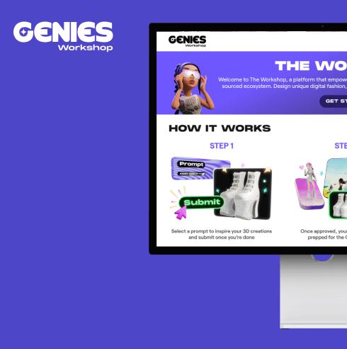
Silver Studio stands as our flagship offering for Genies, serving as a dynamic digital design playground empowering users to express themselves and explore fashion trends freely. Within this endeavor, I play a pivotal role in shaping the visual identity and refining our product pipeline. This encompasses the meticulous design of the tag system, crafting captivating in-app unlockable visuals, and curating seamless onboarding experiences.
Role
UI/UX Design
Visual Design
Tool
Figma

More Contexts
To enhance the user engagement, we're aiming to introduce two new features "Rating & Ranking" allows users to share their opinions by rating outfits and engaging more to climb the rankings billboard, making every user's voice matter.
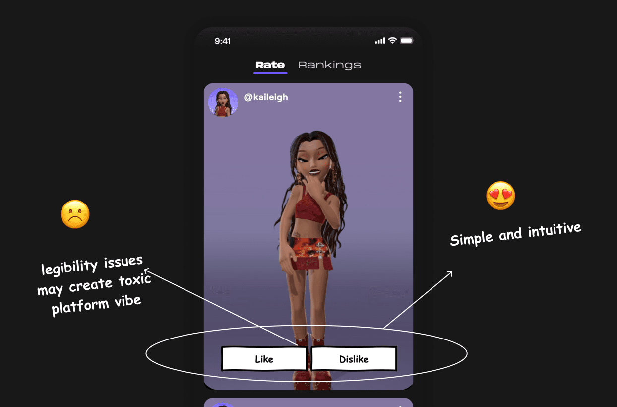
Approach 1: Like & Dislike Buttons
This straightforward approach allows users to express their opinions through "Like" and "Dislike" buttons. While intuitive and easy to use, it can foster a binary and potentially negative feedback environment.
Pros
Quick feedback mechanism
Simple and intuitive
Cons
Lacks nuance and may not provide useful insights
Can create a toxic environment with negative feedback
Approach 2: Fashion Tagging
This approach allows users to tag outfits with specific styles, offering a more nuanced way to express opinions without binary judgments. It encourages positive interactions and helps users discover and refine their style preferences.
Pros
Encourages positive interaction
Helps users discover new styles
Reduces potential for negative feedback
Cons
Requires users to understand and apply tags correctly
May be less immediate than a simple rating system

Approach 3: Inspiration Button
An "Inspire" button allows users to express admiration for an outfit without explicit ratings. This method focuses on positive reinforcement and can inspire creativity among users.
Pros
Promotes positive feedback
Encourages creativity and inspiration
Cons
May not provide enough data for users seeking detailed feedback
Less interactive than a rating system

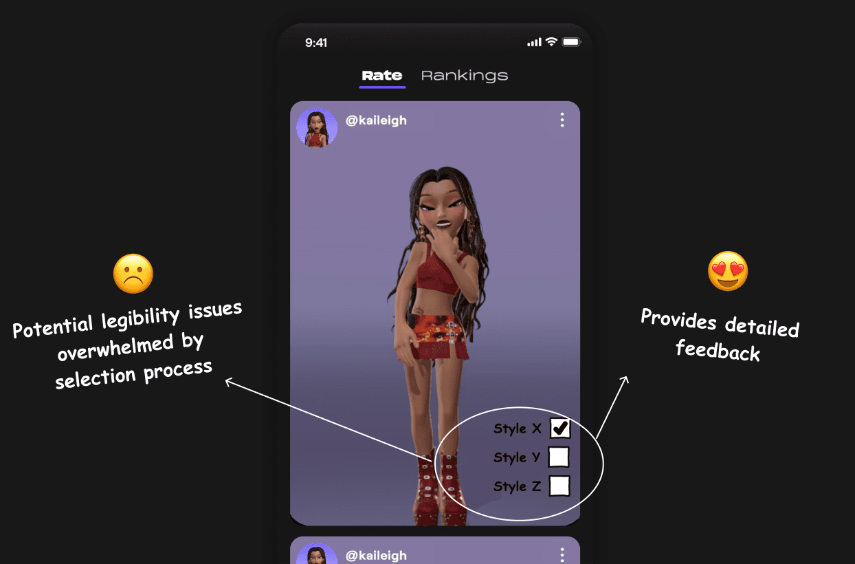
Approach 4: Multi-Choice Selection
This option presents users with a checklist of style categories to choose from when rating an outfit. While it offers detailed feedback, it poses potential legibility issues and could overwhelm users with too much information..
Pros
Provides detailed feedback
Balances user effort with meaningful interaction
Cons
Potential legibility issues due to the amount of information
Users may feel overwhelmed by the selection process
Can be too complex for quick and effortless interaction
Approach 1: Like & Dislike Buttons
This straightforward approach allows users to express their opinions through "Like" and "Dislike" buttons. While intuitive and easy to use, it can foster a binary and potentially negative feedback environment.
Pros
Quick feedback mechanism
Simple and intuitive
Cons
Lacks nuance and may not provide useful insights
Can create a toxic environment with negative feedback

Approach 2: Fashion Tagging
This approach allows users to tag outfits with specific styles, offering a more nuanced way to express opinions without binary judgments. It encourages positive interactions and helps users discover and refine their style preferences.
Pros
Encourages positive interaction
Helps users discover new styles
Reduces potential for negative feedback
Cons
Requires users to understand and apply tags correctly
May be less immediate than a simple rating system

Approach 3: Inspiration Button
An "Inspire" button allows users to express admiration for an outfit without explicit ratings. This method focuses on positive reinforcement and can inspire creativity among users.
Pros
Promotes positive feedback
Encourages creativity and inspiration
Cons
May not provide enough data for users seeking detailed feedback
Less interactive than a rating system

Approach 4: Multi-Choice Selection
This option presents users with a checklist of style categories to choose from when rating an outfit. While it offers detailed feedback, it poses potential legibility issues and could overwhelm users with too much information..
Pros
Provides detailed feedback
Balances user effort with meaningful interaction
Cons
Potential legibility issues due to the amount of information
Users may feel overwhelmed by the selection process
Can be too complex for quick and effortless interaction

Approach 1: Like & Dislike Buttons
This straightforward approach allows users to express their opinions through "Like" and "Dislike" buttons. While intuitive and easy to use, it can foster a binary and potentially negative feedback environment.
Pros
Quick feedback mechanism
Simple and intuitive
Cons
Lacks nuance and may not provide useful insights
Can create a toxic environment with negative feedback

Approach 2: Fashion Tagging
This approach allows users to tag outfits with specific styles, offering a more nuanced way to express opinions without binary judgments. It encourages positive interactions and helps users discover and refine their style preferences.
Pros
Encourages positive interaction
Helps users discover new styles
Reduces potential for negative feedback
Cons
Requires users to understand and apply tags correctly
May be less immediate than a simple rating system

Approach 3: Inspiration Button
An "Inspire" button allows users to express admiration for an outfit without explicit ratings. This method focuses on positive reinforcement and can inspire creativity among users.
Pros
Promotes positive feedback
Encourages creativity and inspiration
Cons
May not provide enough data for users seeking detailed feedback
Less interactive than a rating system

Approach 4: Multi-Choice Selection
This option presents users with a checklist of style categories to choose from when rating an outfit. While it offers detailed feedback, it poses potential legibility issues and could overwhelm users with too much information..
Pros
Provides detailed feedback
Balances user effort with meaningful interaction
Cons
Potential legibility issues due to the amount of information
Users may feel overwhelmed by the selection process
Can be too complex for quick and effortless interaction

Approach 1: Like & Dislike Buttons
This straightforward approach allows users to express their opinions through "Like" and "Dislike" buttons. While intuitive and easy to use, it can foster a binary and potentially negative feedback environment.
Pros
Quick feedback mechanism
Simple and intuitive
Cons
Lacks nuance and may not provide useful insights
Can create a toxic environment with negative feedback

Approach 2: Fashion Tagging
This approach allows users to tag outfits with specific styles, offering a more nuanced way to express opinions without binary judgments. It encourages positive interactions and helps users discover and refine their style preferences.
Pros
Encourages positive interaction
Helps users discover new styles
Reduces potential for negative feedback
Cons
Requires users to understand and apply tags correctly
May be less immediate than a simple rating system

Approach 3: Inspiration Button
An "Inspire" button allows users to express admiration for an outfit without explicit ratings. This method focuses on positive reinforcement and can inspire creativity among users.
Pros
Promotes positive feedback
Encourages creativity and inspiration
Cons
May not provide enough data for users seeking detailed feedback
Less interactive than a rating system

Approach 4: Multi-Choice Selection
This option presents users with a checklist of style categories to choose from when rating an outfit. While it offers detailed feedback, it poses potential legibility issues and could overwhelm users with too much information..
Pros
Provides detailed feedback
Balances user effort with meaningful interaction
Cons
Potential legibility issues due to the amount of information
Users may feel overwhelmed by the selection process
Can be too complex for quick and effortless interaction

Approach 1
Like & Dislike ButtonsThis straightforward approach allows users to express their opinions through "Like" and "Dislike" buttons. While intuitive and easy to use, it can foster a binary and potentially negative feedback environment.
Pros
Quick feedback mechanism
Simple and intuitive
Cons
Lacks nuance and may not provide useful insights
Can create a toxic environment with negative feedback

Approach 2
Fashion TagsThis approach allows users to tag outfits with specific styles, offering a more nuanced way to express opinions without binary judgments.
Pros
Encourages positive interaction
Helps users discover new styles
Reduces potential for negative feedback
Cons
Requires users to understand and apply tags correctly
May be less immediate than a simple rating system

Approach 3
Inspiration ButtonAn "Inspire" button allows users to express admiration for an outfit without explicit ratings. This method focuses on positive reinforcement and can inspire creativity among users.
Pros
Promotes positive feedback
Encourages creativity and inspiration
Cons
May not provide enough data for users seeking detailed feedback
Less interactive than a rating system

Approach 4
Multi-Choice SelectionThis option presents users with a checklist of style categories to choose from when rating an outfit. While it offers detailed feedback, it poses potential legibility issues and could overwhelm users with too much information.
Pros
Provides detailed feedback
Balances user effort with meaningful interaction
Cons
Potential legibility issues due to the amount of information
Users may feel overwhelmed by the selection proces
Can be too complex for quick and effortless interaction

Approach 1
Like & Dislike ButtonsThis straightforward approach allows users to express their opinions through "Like" and "Dislike" buttons. While intuitive and easy to use, it can foster a binary and potentially negative feedback environment.
Pros
Quick feedback mechanism
Simple and intuitive
Cons
Lacks nuance and may not provide useful insights
Can create a toxic environment with negative feedback

Approach 2
Fashion TagsThis approach allows users to tag outfits with specific styles, offering a more nuanced way to express opinions without binary judgments.
Pros
Encourages positive interaction
Helps users discover new styles
Reduces potential for negative feedback
Cons
Requires users to understand and apply tags correctly
May be less immediate than a simple rating system

Approach 3
Inspiration ButtonAn "Inspire" button allows users to express admiration for an outfit without explicit ratings. This method focuses on positive reinforcement and can inspire creativity among users.
Pros
Promotes positive feedback
Encourages creativity and inspiration
Cons
May not provide enough data for users seeking detailed feedback
Less interactive than a rating system

Approach 4
Multi-Choice SelectionThis option presents users with a checklist of style categories to choose from when rating an outfit. While it offers detailed feedback, it poses potential legibility issues and could overwhelm users with too much information.
Pros
Provides detailed feedback
Balances user effort with meaningful interaction
Cons
Potential legibility issues due to the amount of information
Users may feel overwhelmed by the selection proces
Can be too complex for quick and effortless interaction

Approach 1
Like & Dislike ButtonsThis straightforward approach allows users to express their opinions through "Like" and "Dislike" buttons. While intuitive and easy to use, it can foster a binary and potentially negative feedback environment.
Pros
Quick feedback mechanism
Simple and intuitive
Cons
Lacks nuance and may not provide useful insights
Can create a toxic environment with negative feedback

Approach 2
Fashion TagsThis approach allows users to tag outfits with specific styles, offering a more nuanced way to express opinions without binary judgments.
Pros
Encourages positive interaction
Helps users discover new styles
Reduces potential for negative feedback
Cons
Requires users to understand and apply tags correctly
May be less immediate than a simple rating system

Approach 3
Inspiration ButtonAn "Inspire" button allows users to express admiration for an outfit without explicit ratings. This method focuses on positive reinforcement and can inspire creativity among users.
Pros
Promotes positive feedback
Encourages creativity and inspiration
Cons
May not provide enough data for users seeking detailed feedback
Less interactive than a rating system

Approach 4
Multi-Choice SelectionThis option presents users with a checklist of style categories to choose from when rating an outfit. While it offers detailed feedback, it poses potential legibility issues and could overwhelm users with too much information.
Pros
Provides detailed feedback
Balances user effort with meaningful interaction
Cons
Potential legibility issues due to the amount of information
Users may feel overwhelmed by the selection proces
Can be too complex for quick and effortless interaction

Approach 1
Like & Dislike ButtonsThis straightforward approach allows users to express their opinions through "Like" and "Dislike" buttons. While intuitive and easy to use, it can foster a binary and potentially negative feedback environment.
Pros
Quick feedback mechanism
Simple and intuitive
Cons
Lacks nuance and may not provide useful insights
Can create a toxic environment with negative feedback

Approach 2
Fashion TagsThis approach allows users to tag outfits with specific styles, offering a more nuanced way to express opinions without binary judgments.
Pros
Encourages positive interaction
Helps users discover new styles
Reduces potential for negative feedback
Cons
Requires users to understand and apply tags correctly
May be less immediate than a simple rating system

Approach 3
Inspiration ButtonAn "Inspire" button allows users to express admiration for an outfit without explicit ratings. This method focuses on positive reinforcement and can inspire creativity among users.
Pros
Promotes positive feedback
Encourages creativity and inspiration
Cons
May not provide enough data for users seeking detailed feedback
Less interactive than a rating system

Approach 4
Multi-Choice SelectionThis option presents users with a checklist of style categories to choose from when rating an outfit. While it offers detailed feedback, it poses potential legibility issues and could overwhelm users with too much information.
Pros
Provides detailed feedback
Balances user effort with meaningful interaction
Cons
Potential legibility issues due to the amount of information
Users may feel overwhelmed by the selection proces
Can be too complex for quick and effortless interaction

Version 1.0
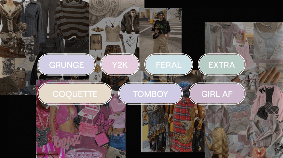
Our product team selected several dominant and trendy styles, transforming them into text chips for easy tagging.
Rating an outfit takes too long.
The tagging system is confusing and difficult to follow.
There are too many tags to choose from, which makes the rating process overwhelming and less enjoyable.
User Feedback
During our user testing phases, we received valuable feedback that highlighted some pain points:
Difficult to Follow: Users found it challenging to navigate the tagging system.
Time-Consuming: Rating one outfit took too long.
Unclear Styles: Users were often unsure about the styles being tagged.
Iteration and Improvement
With an upcoming release date, I took the lead in iterating and enhancing the tagging system to address these concerns.

Full Game-cycle
Drawing from my game design background, I've crafted a new game cycle to motivate users and increase engagement on our platform. Inspired by game mechanics like daily rewards and victory rewards from enemy encounters, users can now rate our fit and earn rewards for their ratings. They can also receive ratings from others, motivating them to create more stylish outfits and climb the leaderboard. This complete game cycle not only boosts user engagement but also fosters communication and a vibrant fashion community within the Silver Studios App.

When users rate enough outfits, they earn special rewards. These rewards are unique items that enhance their experience
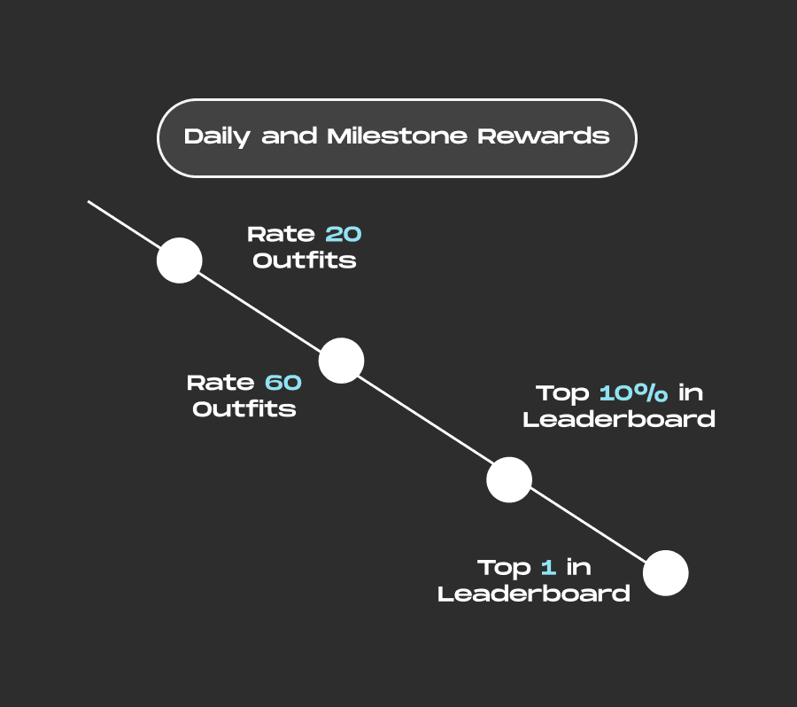
Like in games, users get daily rewards for staying active and special rewards for hitting major rating milestones

Receiving ratings from other users foster a vibrant community where users feel connected and appreciated
Outcome
User Satisfaction
Feedback indicates that users find the rewards motivating and enjoy the gamified aspect of the platform.
Community Growth
There has been a significant rise in user interactions, making our platform more vibrant and lively.
Higher Engagement
We've seen a notable increase in user activity and engagement.
Onboarding Screens
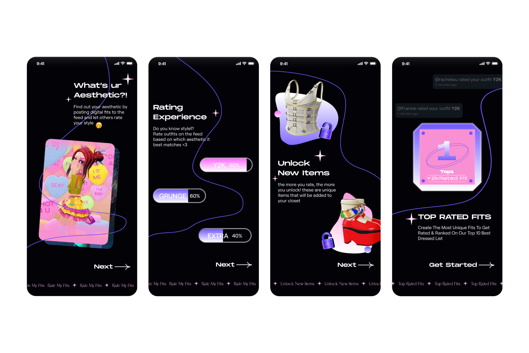
To ensure that new users have a smooth and engaging start, I took the initiative to create a new onboarding screen. This screen serves as a trailer for our updated features, setting the stage for an exciting user experience right from the beginning.

Version 1.0
Our product team selected several dominant and trendy styles, transforming them into text chips for easy tagging.
Rating an outfit takes too long.
The tagging system is confusing and difficult to follow.
There are too many tags to choose from, which makes the rating process overwhelming and less enjoyable.
User Feedback
During our user testing phases, we received valuable feedback that highlighted some pain points:
Difficult to Follow: Users found it challenging to navigate the tagging system.
Time-Consuming: Rating one outfit took too long.
Unclear Styles: Users were often unsure about the styles being tagged.
Iteration and Improvement
With an upcoming release date, I took the lead in iterating and enhancing the tagging system to address these concerns.

Onboarding Screens
To ensure that new users have a smooth and engaging start, I took the initiative to create a new onboarding screen. This screen serves as a trailer for our updated features, setting the stage for an exciting user experience right from the beginning.

Approach 1: Like & Dislike Buttons
This straightforward approach allows users to express their opinions through "Like" and "Dislike" buttons. While intuitive and easy to use, it can foster a binary and potentially negative feedback environment.
Pros
Quick feedback mechanism
Simple and intuitive
Cons
Lacks nuance and may not provide useful insights
Can create a toxic environment with negative feedback

Approach 2: Fashion Tagging
This approach allows users to tag outfits with specific styles, offering a more nuanced way to express opinions without binary judgments.
Pros
Encourages positive interaction 2. Helps users discover new styles
Reduces potential for negative feedback
Cons
Requires users to understand and apply tags correctly
May be less immediate than a simple rating system

Approach 3: Inspiration Button
An "Inspire" button allows users to express admiration for an outfit without explicit ratings. This method focuses on positive reinforcement and can inspire creativity among users.
Pros
Promotes positive feedback
Encourages creativity and inspiration
Cons
May not provide enough data for users seeking detailed feedback
Less interactive than a rating system

Approach 4: Multi-Choice Selection
This option presents users with a checklist of style categories to choose from when rating an outfit. While it offers detailed feedback, it poses potential legibility issues and could overwhelm users with too much information.
Pros
Provides detailed feedback
Balances user effort with meaningful interaction
Cons
Potential legibility issues due to the amount of information
Users may feel overwhelmed by the selection proces
Can be too complex for quick and effortless interaction

Approach 1: Like & Dislike Buttons
This straightforward approach allows users to express their opinions through "Like" and "Dislike" buttons. While intuitive and easy to use, it can foster a binary and potentially negative feedback environment.
Pros
Quick feedback mechanism
Simple and intuitive
Cons
Lacks nuance and may not provide useful insights
Can create a toxic environment with negative feedback

Approach 2: Fashion Tagging
This approach allows users to tag outfits with specific styles, offering a more nuanced way to express opinions without binary judgments.
Pros
Encourages positive interaction 2. Helps users discover new styles
Reduces potential for negative feedback
Cons
Requires users to understand and apply tags correctly
May be less immediate than a simple rating system

Approach 3: Inspiration Button
An "Inspire" button allows users to express admiration for an outfit without explicit ratings. This method focuses on positive reinforcement and can inspire creativity among users.
Pros
Promotes positive feedback
Encourages creativity and inspiration
Cons
May not provide enough data for users seeking detailed feedback
Less interactive than a rating system

Approach 4: Multi-Choice Selection
This option presents users with a checklist of style categories to choose from when rating an outfit. While it offers detailed feedback, it poses potential legibility issues and could overwhelm users with too much information.
Pros
Provides detailed feedback
Balances user effort with meaningful interaction
Cons
Potential legibility issues due to the amount of information
Users may feel overwhelmed by the selection proces
Can be too complex for quick and effortless interaction

Approach 1: Like & Dislike Buttons
This straightforward approach allows users to express their opinions through "Like" and "Dislike" buttons. While intuitive and easy to use, it can foster a binary and potentially negative feedback environment.
Pros
Quick feedback mechanism
Simple and intuitive
Cons
Lacks nuance and may not provide useful insights
Can create a toxic environment with negative feedback

Approach 2: Fashion Tagging
This approach allows users to tag outfits with specific styles, offering a more nuanced way to express opinions without binary judgments.
Pros
Encourages positive interaction 2. Helps users discover new styles
Reduces potential for negative feedback
Cons
Requires users to understand and apply tags correctly
May be less immediate than a simple rating system

Approach 3: Inspiration Button
An "Inspire" button allows users to express admiration for an outfit without explicit ratings. This method focuses on positive reinforcement and can inspire creativity among users.
Pros
Promotes positive feedback
Encourages creativity and inspiration
Cons
May not provide enough data for users seeking detailed feedback
Less interactive than a rating system

Approach 4: Multi-Choice Selection
This option presents users with a checklist of style categories to choose from when rating an outfit. While it offers detailed feedback, it poses potential legibility issues and could overwhelm users with too much information.
Pros
Provides detailed feedback
Balances user effort with meaningful interaction
Cons
Potential legibility issues due to the amount of information
Users may feel overwhelmed by the selection proces
Can be too complex for quick and effortless interaction

Approach 1: Like & Dislike Buttons
This straightforward approach allows users to express their opinions through "Like" and "Dislike" buttons. While intuitive and easy to use, it can foster a binary and potentially negative feedback environment.
Pros
Quick feedback mechanism
Simple and intuitive
Cons
Lacks nuance and may not provide useful insights
Can create a toxic environment with negative feedback

Approach 2: Fashion Tagging
This approach allows users to tag outfits with specific styles, offering a more nuanced way to express opinions without binary judgments.
Pros
Encourages positive interaction 2. Helps users discover new styles
Reduces potential for negative feedback
Cons
Requires users to understand and apply tags correctly
May be less immediate than a simple rating system

Approach 3: Inspiration Button
An "Inspire" button allows users to express admiration for an outfit without explicit ratings. This method focuses on positive reinforcement and can inspire creativity among users.
Pros
Promotes positive feedback
Encourages creativity and inspiration
Cons
May not provide enough data for users seeking detailed feedback
Less interactive than a rating system

Approach 4: Multi-Choice Selection
This option presents users with a checklist of style categories to choose from when rating an outfit. While it offers detailed feedback, it poses potential legibility issues and could overwhelm users with too much information.
Pros
Provides detailed feedback
Balances user effort with meaningful interaction
Cons
Potential legibility issues due to the amount of information
Users may feel overwhelmed by the selection proces
Can be too complex for quick and effortless interaction

Assets Design
Visual Design
Silver Studios
Visual Design
Overview
Silver Studio stands as our flagship offering for Genies, serving as a dynamic digital design playground empowering users to express themselves and explore fashion trends freely. Within this endeavor, I play a pivotal role in shaping the visual identity and refining our product pipeline. This encompasses the meticulous design of the tag system, crafting captivating in-app unlockable visuals, and curating seamless onboarding experiences.
Role
UI/UX Design
Visual Design
Tool
Figma

More Contexts
To enhance the user engagement, we're aiming to introduce two new features "Rating & Ranking" allows users to share their opinions by rating outfits and engaging more to climb the rankings billboard, making every user's voice matter.
Approach 1: Like & Dislike Buttons
This straightforward approach allows users to express their opinions through "Like" and "Dislike" buttons. While intuitive and easy to use, it can foster a binary and potentially negative feedback environment.
Pros
Quick feedback mechanism
Simple and intuitive
Cons
Lacks nuance and may not provide useful insights
Can create a toxic environment with negative feedback

Approach 2: Fashion Tagging
This approach allows users to tag outfits with specific styles, offering a more nuanced way to express opinions without binary judgments. It encourages positive interactions and helps users discover and refine their style preferences.
Pros
Encourages positive interaction
Helps users discover new styles
Reduces potential for negative feedback
Cons
Requires users to understand and apply tags correctly
May be less immediate than a simple rating system

Approach 3: Inspiration Button
An "Inspire" button allows users to express admiration for an outfit without explicit ratings. This method focuses on positive reinforcement and can inspire creativity among users.
Pros
Promotes positive feedback
Encourages creativity and inspiration
Cons
May not provide enough data for users seeking detailed feedback
Less interactive than a rating system

Approach 4: Multi-Choice Selection
This option presents users with a checklist of style categories to choose from when rating an outfit. While it offers detailed feedback, it poses potential legibility issues and could overwhelm users with too much information..
Pros
Provides detailed feedback
Balances user effort with meaningful interaction
Cons
Potential legibility issues due to the amount of information
Users may feel overwhelmed by the selection process
Can be too complex for quick and effortless interaction

Approach 1: Like & Dislike Buttons
This straightforward approach allows users to express their opinions through "Like" and "Dislike" buttons. While intuitive and easy to use, it can foster a binary and potentially negative feedback environment.
Pros
Quick feedback mechanism
Simple and intuitive
Cons
Lacks nuance and may not provide useful insights
Can create a toxic environment with negative feedback

Approach 2: Fashion Tagging
This approach allows users to tag outfits with specific styles, offering a more nuanced way to express opinions without binary judgments. It encourages positive interactions and helps users discover and refine their style preferences.
Pros
Encourages positive interaction
Helps users discover new styles
Reduces potential for negative feedback
Cons
Requires users to understand and apply tags correctly
May be less immediate than a simple rating system

Approach 3: Inspiration Button
An "Inspire" button allows users to express admiration for an outfit without explicit ratings. This method focuses on positive reinforcement and can inspire creativity among users.
Pros
Promotes positive feedback
Encourages creativity and inspiration
Cons
May not provide enough data for users seeking detailed feedback
Less interactive than a rating system

Approach 4: Multi-Choice Selection
This option presents users with a checklist of style categories to choose from when rating an outfit. While it offers detailed feedback, it poses potential legibility issues and could overwhelm users with too much information..
Pros
Provides detailed feedback
Balances user effort with meaningful interaction
Cons
Potential legibility issues due to the amount of information
Users may feel overwhelmed by the selection process
Can be too complex for quick and effortless interaction

Approach 1: Like & Dislike Buttons
This straightforward approach allows users to express their opinions through "Like" and "Dislike" buttons. While intuitive and easy to use, it can foster a binary and potentially negative feedback environment.
Pros
Quick feedback mechanism
Simple and intuitive
Cons
Lacks nuance and may not provide useful insights
Can create a toxic environment with negative feedback

Approach 2: Fashion Tagging
This approach allows users to tag outfits with specific styles, offering a more nuanced way to express opinions without binary judgments. It encourages positive interactions and helps users discover and refine their style preferences.
Pros
Encourages positive interaction
Helps users discover new styles
Reduces potential for negative feedback
Cons
Requires users to understand and apply tags correctly
May be less immediate than a simple rating system

Approach 3: Inspiration Button
An "Inspire" button allows users to express admiration for an outfit without explicit ratings. This method focuses on positive reinforcement and can inspire creativity among users.
Pros
Promotes positive feedback
Encourages creativity and inspiration
Cons
May not provide enough data for users seeking detailed feedback
Less interactive than a rating system

Approach 4: Multi-Choice Selection
This option presents users with a checklist of style categories to choose from when rating an outfit. While it offers detailed feedback, it poses potential legibility issues and could overwhelm users with too much information..
Pros
Provides detailed feedback
Balances user effort with meaningful interaction
Cons
Potential legibility issues due to the amount of information
Users may feel overwhelmed by the selection process
Can be too complex for quick and effortless interaction

Approach 1: Like & Dislike Buttons
This straightforward approach allows users to express their opinions through "Like" and "Dislike" buttons. While intuitive and easy to use, it can foster a binary and potentially negative feedback environment.
Pros
Quick feedback mechanism
Simple and intuitive
Cons
Lacks nuance and may not provide useful insights
Can create a toxic environment with negative feedback

Approach 2: Fashion Tagging
This approach allows users to tag outfits with specific styles, offering a more nuanced way to express opinions without binary judgments. It encourages positive interactions and helps users discover and refine their style preferences.
Pros
Encourages positive interaction
Helps users discover new styles
Reduces potential for negative feedback
Cons
Requires users to understand and apply tags correctly
May be less immediate than a simple rating system

Approach 3: Inspiration Button
An "Inspire" button allows users to express admiration for an outfit without explicit ratings. This method focuses on positive reinforcement and can inspire creativity among users.
Pros
Promotes positive feedback
Encourages creativity and inspiration
Cons
May not provide enough data for users seeking detailed feedback
Less interactive than a rating system

Approach 4: Multi-Choice Selection
This option presents users with a checklist of style categories to choose from when rating an outfit. While it offers detailed feedback, it poses potential legibility issues and could overwhelm users with too much information..
Pros
Provides detailed feedback
Balances user effort with meaningful interaction
Cons
Potential legibility issues due to the amount of information
Users may feel overwhelmed by the selection process
Can be too complex for quick and effortless interaction

Approach 1
Like & Dislike ButtonsThis straightforward approach allows users to express their opinions through "Like" and "Dislike" buttons. While intuitive and easy to use, it can foster a binary and potentially negative feedback environment.
Pros
Quick feedback mechanism
Simple and intuitive
Cons
Lacks nuance and may not provide useful insights
Can create a toxic environment with negative feedback

Approach 2
Fashion TagsThis approach allows users to tag outfits with specific styles, offering a more nuanced way to express opinions without binary judgments.
Pros
Encourages positive interaction
Helps users discover new styles
Reduces potential for negative feedback
Cons
Requires users to understand and apply tags correctly
May be less immediate than a simple rating system

Approach 3
Inspiration ButtonAn "Inspire" button allows users to express admiration for an outfit without explicit ratings. This method focuses on positive reinforcement and can inspire creativity among users.
Pros
Promotes positive feedback
Encourages creativity and inspiration
Cons
May not provide enough data for users seeking detailed feedback
Less interactive than a rating system

Approach 4
Multi-Choice SelectionThis option presents users with a checklist of style categories to choose from when rating an outfit. While it offers detailed feedback, it poses potential legibility issues and could overwhelm users with too much information.
Pros
Provides detailed feedback
Balances user effort with meaningful interaction
Cons
Potential legibility issues due to the amount of information
Users may feel overwhelmed by the selection proces
Can be too complex for quick and effortless interaction

Approach 1
Like & Dislike ButtonsThis straightforward approach allows users to express their opinions through "Like" and "Dislike" buttons. While intuitive and easy to use, it can foster a binary and potentially negative feedback environment.
Pros
Quick feedback mechanism
Simple and intuitive
Cons
Lacks nuance and may not provide useful insights
Can create a toxic environment with negative feedback

Approach 2
Fashion TagsThis approach allows users to tag outfits with specific styles, offering a more nuanced way to express opinions without binary judgments.
Pros
Encourages positive interaction
Helps users discover new styles
Reduces potential for negative feedback
Cons
Requires users to understand and apply tags correctly
May be less immediate than a simple rating system

Approach 3
Inspiration ButtonAn "Inspire" button allows users to express admiration for an outfit without explicit ratings. This method focuses on positive reinforcement and can inspire creativity among users.
Pros
Promotes positive feedback
Encourages creativity and inspiration
Cons
May not provide enough data for users seeking detailed feedback
Less interactive than a rating system

Approach 4
Multi-Choice SelectionThis option presents users with a checklist of style categories to choose from when rating an outfit. While it offers detailed feedback, it poses potential legibility issues and could overwhelm users with too much information.
Pros
Provides detailed feedback
Balances user effort with meaningful interaction
Cons
Potential legibility issues due to the amount of information
Users may feel overwhelmed by the selection proces
Can be too complex for quick and effortless interaction

Approach 1
Like & Dislike ButtonsThis straightforward approach allows users to express their opinions through "Like" and "Dislike" buttons. While intuitive and easy to use, it can foster a binary and potentially negative feedback environment.
Pros
Quick feedback mechanism
Simple and intuitive
Cons
Lacks nuance and may not provide useful insights
Can create a toxic environment with negative feedback

Approach 2
Fashion TagsThis approach allows users to tag outfits with specific styles, offering a more nuanced way to express opinions without binary judgments.
Pros
Encourages positive interaction
Helps users discover new styles
Reduces potential for negative feedback
Cons
Requires users to understand and apply tags correctly
May be less immediate than a simple rating system

Approach 3
Inspiration ButtonAn "Inspire" button allows users to express admiration for an outfit without explicit ratings. This method focuses on positive reinforcement and can inspire creativity among users.
Pros
Promotes positive feedback
Encourages creativity and inspiration
Cons
May not provide enough data for users seeking detailed feedback
Less interactive than a rating system

Approach 4
Multi-Choice SelectionThis option presents users with a checklist of style categories to choose from when rating an outfit. While it offers detailed feedback, it poses potential legibility issues and could overwhelm users with too much information.
Pros
Provides detailed feedback
Balances user effort with meaningful interaction
Cons
Potential legibility issues due to the amount of information
Users may feel overwhelmed by the selection proces
Can be too complex for quick and effortless interaction

Approach 1
Like & Dislike ButtonsThis straightforward approach allows users to express their opinions through "Like" and "Dislike" buttons. While intuitive and easy to use, it can foster a binary and potentially negative feedback environment.
Pros
Quick feedback mechanism
Simple and intuitive
Cons
Lacks nuance and may not provide useful insights
Can create a toxic environment with negative feedback

Approach 2
Fashion TagsThis approach allows users to tag outfits with specific styles, offering a more nuanced way to express opinions without binary judgments.
Pros
Encourages positive interaction
Helps users discover new styles
Reduces potential for negative feedback
Cons
Requires users to understand and apply tags correctly
May be less immediate than a simple rating system

Approach 3
Inspiration ButtonAn "Inspire" button allows users to express admiration for an outfit without explicit ratings. This method focuses on positive reinforcement and can inspire creativity among users.
Pros
Promotes positive feedback
Encourages creativity and inspiration
Cons
May not provide enough data for users seeking detailed feedback
Less interactive than a rating system

Approach 4
Multi-Choice SelectionThis option presents users with a checklist of style categories to choose from when rating an outfit. While it offers detailed feedback, it poses potential legibility issues and could overwhelm users with too much information.
Pros
Provides detailed feedback
Balances user effort with meaningful interaction
Cons
Potential legibility issues due to the amount of information
Users may feel overwhelmed by the selection proces
Can be too complex for quick and effortless interaction


Version 1.0
Our product team selected several dominant and trendy styles, transforming them into text chips for easy tagging
Rating an outfit takes too long.
The tagging system is confusing and difficult to follow.
There are too many tags to choose from, which makes the rating process overwhelming and less enjoyable.
User Feedback
During our user testing phases, we received valuable feedback that highlighted some pain points:
Difficult to Follow: Users found it challenging to navigate the tagging system.
Time-Consuming: Rating one outfit took too long.
Unclear Styles: Users were often unsure about the styles being tagged.
Iteration and Improvement
With an upcoming release date, I took the lead in iterating and enhancing the tagging system to address these concerns.

Full Game-cycle
Drawing from my game design background, I've crafted a new game cycle to motivate users and increase engagement on our platform. Inspired by game mechanics like daily rewards and victory rewards from enemy encounters, users can now rate our fit and earn rewards for their ratings. They can also receive ratings from others, motivating them to create more stylish outfits and climb the leaderboard. This complete game cycle not only boosts user engagement but also fosters communication and a vibrant fashion community within the Silver Studios App.

When users rate enough outfits, they earn special rewards. These rewards are unique items that enhance their experience

Like in games, users get daily rewards for staying active and special rewards for hitting major rating milestones

Receiving ratings from other users foster a vibrant community where users feel connected and appreciated
Outcome
User Satisfaction
Feedback indicates that users find the rewards motivating and enjoy the gamified aspect of the platform.
Community Growth
There has been a significant rise in user interactions, making our platform more vibrant and lively.
Higher Engagement
We've seen a notable increase in user activity and engagement.
Onboarding Screens
To ensure that new users have a smooth and engaging start, I took the initiative to create a new onboarding screen. This screen serves as a trailer for our updated features, setting the stage for an exciting user experience right from the beginning.


Version 1.0
Our product team selected several dominant and trendy styles, transforming them into text chips for easy tagging.
Rating an outfit takes too long.
The tagging system is confusing and difficult to follow.
There are too many tags to choose from, which makes the rating process overwhelming and less enjoyable.
User Feedback
During our user testing phases, we received valuable feedback that highlighted some pain points:
Difficult to Follow: Users found it challenging to navigate the tagging system.
Time-Consuming: Rating one outfit took too long.
Unclear Styles: Users were often unsure about the styles being tagged.
Iteration and Improvement
With an upcoming release date, I took the lead in iterating and enhancing the tagging system to address these concerns.

Onboarding Screens
To ensure that new users have a smooth and engaging start, I took the initiative to create a new onboarding screen. This screen serves as a trailer for our updated features, setting the stage for an exciting user experience right from the beginning.

Approach 1: Like & Dislike Buttons
This straightforward approach allows users to express their opinions through "Like" and "Dislike" buttons. While intuitive and easy to use, it can foster a binary and potentially negative feedback environment.
Pros
Quick feedback mechanism
Simple and intuitive
Cons
Lacks nuance and may not provide useful insights
Can create a toxic environment with negative feedback

Approach 2: Fashion Tagging
This approach allows users to tag outfits with specific styles, offering a more nuanced way to express opinions without binary judgments.
Pros
Encourages positive interaction 2. Helps users discover new styles
Reduces potential for negative feedback
Cons
Requires users to understand and apply tags correctly
May be less immediate than a simple rating system

Approach 3: Inspiration Button
An "Inspire" button allows users to express admiration for an outfit without explicit ratings. This method focuses on positive reinforcement and can inspire creativity among users.
Pros
Promotes positive feedback
Encourages creativity and inspiration
Cons
May not provide enough data for users seeking detailed feedback
Less interactive than a rating system

Approach 4: Multi-Choice Selection
This option presents users with a checklist of style categories to choose from when rating an outfit. While it offers detailed feedback, it poses potential legibility issues and could overwhelm users with too much information.
Pros
Provides detailed feedback
Balances user effort with meaningful interaction
Cons
Potential legibility issues due to the amount of information
Users may feel overwhelmed by the selection proces
Can be too complex for quick and effortless interaction

Approach 1: Like & Dislike Buttons
This straightforward approach allows users to express their opinions through "Like" and "Dislike" buttons. While intuitive and easy to use, it can foster a binary and potentially negative feedback environment.
Pros
Quick feedback mechanism
Simple and intuitive
Cons
Lacks nuance and may not provide useful insights
Can create a toxic environment with negative feedback

Approach 2: Fashion Tagging
This approach allows users to tag outfits with specific styles, offering a more nuanced way to express opinions without binary judgments.
Pros
Encourages positive interaction 2. Helps users discover new styles
Reduces potential for negative feedback
Cons
Requires users to understand and apply tags correctly
May be less immediate than a simple rating system

Approach 3: Inspiration Button
An "Inspire" button allows users to express admiration for an outfit without explicit ratings. This method focuses on positive reinforcement and can inspire creativity among users.
Pros
Promotes positive feedback
Encourages creativity and inspiration
Cons
May not provide enough data for users seeking detailed feedback
Less interactive than a rating system

Approach 4: Multi-Choice Selection
This option presents users with a checklist of style categories to choose from when rating an outfit. While it offers detailed feedback, it poses potential legibility issues and could overwhelm users with too much information.
Pros
Provides detailed feedback
Balances user effort with meaningful interaction
Cons
Potential legibility issues due to the amount of information
Users may feel overwhelmed by the selection proces
Can be too complex for quick and effortless interaction

Approach 1: Like & Dislike Buttons
This straightforward approach allows users to express their opinions through "Like" and "Dislike" buttons. While intuitive and easy to use, it can foster a binary and potentially negative feedback environment.
Pros
Quick feedback mechanism
Simple and intuitive
Cons
Lacks nuance and may not provide useful insights
Can create a toxic environment with negative feedback

Approach 2: Fashion Tagging
This approach allows users to tag outfits with specific styles, offering a more nuanced way to express opinions without binary judgments.
Pros
Encourages positive interaction 2. Helps users discover new styles
Reduces potential for negative feedback
Cons
Requires users to understand and apply tags correctly
May be less immediate than a simple rating system

Approach 3: Inspiration Button
An "Inspire" button allows users to express admiration for an outfit without explicit ratings. This method focuses on positive reinforcement and can inspire creativity among users.
Pros
Promotes positive feedback
Encourages creativity and inspiration
Cons
May not provide enough data for users seeking detailed feedback
Less interactive than a rating system

Approach 4: Multi-Choice Selection
This option presents users with a checklist of style categories to choose from when rating an outfit. While it offers detailed feedback, it poses potential legibility issues and could overwhelm users with too much information.
Pros
Provides detailed feedback
Balances user effort with meaningful interaction
Cons
Potential legibility issues due to the amount of information
Users may feel overwhelmed by the selection proces
Can be too complex for quick and effortless interaction

Approach 1: Like & Dislike Buttons
This straightforward approach allows users to express their opinions through "Like" and "Dislike" buttons. While intuitive and easy to use, it can foster a binary and potentially negative feedback environment.
Pros
Quick feedback mechanism
Simple and intuitive
Cons
Lacks nuance and may not provide useful insights
Can create a toxic environment with negative feedback

Approach 2: Fashion Tagging
This approach allows users to tag outfits with specific styles, offering a more nuanced way to express opinions without binary judgments.
Pros
Encourages positive interaction 2. Helps users discover new styles
Reduces potential for negative feedback
Cons
Requires users to understand and apply tags correctly
May be less immediate than a simple rating system

Approach 3: Inspiration Button
An "Inspire" button allows users to express admiration for an outfit without explicit ratings. This method focuses on positive reinforcement and can inspire creativity among users.
Pros
Promotes positive feedback
Encourages creativity and inspiration
Cons
May not provide enough data for users seeking detailed feedback
Less interactive than a rating system

Approach 4: Multi-Choice Selection
This option presents users with a checklist of style categories to choose from when rating an outfit. While it offers detailed feedback, it poses potential legibility issues and could overwhelm users with too much information.
Pros
Provides detailed feedback
Balances user effort with meaningful interaction
Cons
Potential legibility issues due to the amount of information
Users may feel overwhelmed by the selection proces
Can be too complex for quick and effortless interaction

Assets Design
Visual Design
Silver Studios Visual Design
Overview
Silver Studio stands as our flagship offering for Genies, serving as a dynamic digital design playground empowering users to express themselves and explore fashion trends freely. Within this endeavor, I play a pivotal role in shaping the visual identity and refining our product pipeline. This encompasses the meticulous design of the tag system, crafting captivating in-app unlockable visuals, and curating seamless onboarding experiences.
Role
UI/UX Design
Visual Design
Tool
Figma

More Contexts
To enhance the user engagement, we're aiming to introduce two new features "Rating & Ranking" allows users to share their opinions by rating outfits and engaging more to climb the rankings billboard, making every user's voice matter.
Approach 1: Like & Dislike Buttons
This straightforward approach allows users to express their opinions through "Like" and "Dislike" buttons. While intuitive and easy to use, it can foster a binary and potentially negative feedback environment.
Pros
Quick feedback mechanism
Simple and intuitive
Cons
Lacks nuance and may not provide useful insights
Can create a toxic environment with negative feedback

Approach 2: Fashion Tagging
This approach allows users to tag outfits with specific styles, offering a more nuanced way to express opinions without binary judgments. It encourages positive interactions and helps users discover and refine their style preferences.
Pros
Encourages positive interaction
Helps users discover new styles
Reduces potential for negative feedback
Cons
Requires users to understand and apply tags correctly
May be less immediate than a simple rating system

Approach 3: Inspiration Button
An "Inspire" button allows users to express admiration for an outfit without explicit ratings. This method focuses on positive reinforcement and can inspire creativity among users.
Pros
Promotes positive feedback
Encourages creativity and inspiration
Cons
May not provide enough data for users seeking detailed feedback
Less interactive than a rating system

Approach 4: Multi-Choice Selection
This option presents users with a checklist of style categories to choose from when rating an outfit. While it offers detailed feedback, it poses potential legibility issues and could overwhelm users with too much information..
Pros
Provides detailed feedback
Balances user effort with meaningful interaction
Cons
Potential legibility issues due to the amount of information
Users may feel overwhelmed by the selection process
Can be too complex for quick and effortless interaction

Approach 1: Like & Dislike Buttons
This straightforward approach allows users to express their opinions through "Like" and "Dislike" buttons. While intuitive and easy to use, it can foster a binary and potentially negative feedback environment.
Pros
Quick feedback mechanism
Simple and intuitive
Cons
Lacks nuance and may not provide useful insights
Can create a toxic environment with negative feedback

Approach 2: Fashion Tagging
This approach allows users to tag outfits with specific styles, offering a more nuanced way to express opinions without binary judgments. It encourages positive interactions and helps users discover and refine their style preferences.
Pros
Encourages positive interaction
Helps users discover new styles
Reduces potential for negative feedback
Cons
Requires users to understand and apply tags correctly
May be less immediate than a simple rating system

Approach 3: Inspiration Button
An "Inspire" button allows users to express admiration for an outfit without explicit ratings. This method focuses on positive reinforcement and can inspire creativity among users.
Pros
Promotes positive feedback
Encourages creativity and inspiration
Cons
May not provide enough data for users seeking detailed feedback
Less interactive than a rating system

Approach 4: Multi-Choice Selection
This option presents users with a checklist of style categories to choose from when rating an outfit. While it offers detailed feedback, it poses potential legibility issues and could overwhelm users with too much information..
Pros
Provides detailed feedback
Balances user effort with meaningful interaction
Cons
Potential legibility issues due to the amount of information
Users may feel overwhelmed by the selection process
Can be too complex for quick and effortless interaction

Approach 1: Like & Dislike Buttons
This straightforward approach allows users to express their opinions through "Like" and "Dislike" buttons. While intuitive and easy to use, it can foster a binary and potentially negative feedback environment.
Pros
Quick feedback mechanism
Simple and intuitive
Cons
Lacks nuance and may not provide useful insights
Can create a toxic environment with negative feedback

Approach 2: Fashion Tagging
This approach allows users to tag outfits with specific styles, offering a more nuanced way to express opinions without binary judgments. It encourages positive interactions and helps users discover and refine their style preferences.
Pros
Encourages positive interaction
Helps users discover new styles
Reduces potential for negative feedback
Cons
Requires users to understand and apply tags correctly
May be less immediate than a simple rating system

Approach 3: Inspiration Button
An "Inspire" button allows users to express admiration for an outfit without explicit ratings. This method focuses on positive reinforcement and can inspire creativity among users.
Pros
Promotes positive feedback
Encourages creativity and inspiration
Cons
May not provide enough data for users seeking detailed feedback
Less interactive than a rating system

Approach 4: Multi-Choice Selection
This option presents users with a checklist of style categories to choose from when rating an outfit. While it offers detailed feedback, it poses potential legibility issues and could overwhelm users with too much information..
Pros
Provides detailed feedback
Balances user effort with meaningful interaction
Cons
Potential legibility issues due to the amount of information
Users may feel overwhelmed by the selection process
Can be too complex for quick and effortless interaction

Approach 1: Like & Dislike Buttons
This straightforward approach allows users to express their opinions through "Like" and "Dislike" buttons. While intuitive and easy to use, it can foster a binary and potentially negative feedback environment.
Pros
Quick feedback mechanism
Simple and intuitive
Cons
Lacks nuance and may not provide useful insights
Can create a toxic environment with negative feedback

Approach 2: Fashion Tagging
This approach allows users to tag outfits with specific styles, offering a more nuanced way to express opinions without binary judgments. It encourages positive interactions and helps users discover and refine their style preferences.
Pros
Encourages positive interaction
Helps users discover new styles
Reduces potential for negative feedback
Cons
Requires users to understand and apply tags correctly
May be less immediate than a simple rating system

Approach 3: Inspiration Button
An "Inspire" button allows users to express admiration for an outfit without explicit ratings. This method focuses on positive reinforcement and can inspire creativity among users.
Pros
Promotes positive feedback
Encourages creativity and inspiration
Cons
May not provide enough data for users seeking detailed feedback
Less interactive than a rating system

Approach 4: Multi-Choice Selection
This option presents users with a checklist of style categories to choose from when rating an outfit. While it offers detailed feedback, it poses potential legibility issues and could overwhelm users with too much information..
Pros
Provides detailed feedback
Balances user effort with meaningful interaction
Cons
Potential legibility issues due to the amount of information
Users may feel overwhelmed by the selection process
Can be too complex for quick and effortless interaction

Approach 1
Like & Dislike ButtonsThis straightforward approach allows users to express their opinions through "Like" and "Dislike" buttons. While intuitive and easy to use, it can foster a binary and potentially negative feedback environment.
Pros
Quick feedback mechanism
Simple and intuitive
Cons
Lacks nuance and may not provide useful insights
Can create a toxic environment with negative feedback

Approach 2
Fashion TagsThis approach allows users to tag outfits with specific styles, offering a more nuanced way to express opinions without binary judgments.
Pros
Encourages positive interaction
Helps users discover new styles
Reduces potential for negative feedback
Cons
Requires users to understand and apply tags correctly
May be less immediate than a simple rating system

Approach 3
Inspiration ButtonAn "Inspire" button allows users to express admiration for an outfit without explicit ratings. This method focuses on positive reinforcement and can inspire creativity among users.
Pros
Promotes positive feedback
Encourages creativity and inspiration
Cons
May not provide enough data for users seeking detailed feedback
Less interactive than a rating system

Approach 4
Multi-Choice SelectionThis option presents users with a checklist of style categories to choose from when rating an outfit. While it offers detailed feedback, it poses potential legibility issues and could overwhelm users with too much information.
Pros
Provides detailed feedback
Balances user effort with meaningful interaction
Cons
Potential legibility issues due to the amount of information
Users may feel overwhelmed by the selection proces
Can be too complex for quick and effortless interaction

Approach 1
Like & Dislike ButtonsThis straightforward approach allows users to express their opinions through "Like" and "Dislike" buttons. While intuitive and easy to use, it can foster a binary and potentially negative feedback environment.
Pros
Quick feedback mechanism
Simple and intuitive
Cons
Lacks nuance and may not provide useful insights
Can create a toxic environment with negative feedback

Approach 2
Fashion TagsThis approach allows users to tag outfits with specific styles, offering a more nuanced way to express opinions without binary judgments.
Pros
Encourages positive interaction
Helps users discover new styles
Reduces potential for negative feedback
Cons
Requires users to understand and apply tags correctly
May be less immediate than a simple rating system

Approach 3
Inspiration ButtonAn "Inspire" button allows users to express admiration for an outfit without explicit ratings. This method focuses on positive reinforcement and can inspire creativity among users.
Pros
Promotes positive feedback
Encourages creativity and inspiration
Cons
May not provide enough data for users seeking detailed feedback
Less interactive than a rating system

Approach 4
Multi-Choice SelectionThis option presents users with a checklist of style categories to choose from when rating an outfit. While it offers detailed feedback, it poses potential legibility issues and could overwhelm users with too much information.
Pros
Provides detailed feedback
Balances user effort with meaningful interaction
Cons
Potential legibility issues due to the amount of information
Users may feel overwhelmed by the selection proces
Can be too complex for quick and effortless interaction

Approach 1
Like & Dislike ButtonsThis straightforward approach allows users to express their opinions through "Like" and "Dislike" buttons. While intuitive and easy to use, it can foster a binary and potentially negative feedback environment.
Pros
Quick feedback mechanism
Simple and intuitive
Cons
Lacks nuance and may not provide useful insights
Can create a toxic environment with negative feedback

Approach 2
Fashion TagsThis approach allows users to tag outfits with specific styles, offering a more nuanced way to express opinions without binary judgments.
Pros
Encourages positive interaction
Helps users discover new styles
Reduces potential for negative feedback
Cons
Requires users to understand and apply tags correctly
May be less immediate than a simple rating system

Approach 3
Inspiration ButtonAn "Inspire" button allows users to express admiration for an outfit without explicit ratings. This method focuses on positive reinforcement and can inspire creativity among users.
Pros
Promotes positive feedback
Encourages creativity and inspiration
Cons
May not provide enough data for users seeking detailed feedback
Less interactive than a rating system

Approach 4
Multi-Choice SelectionThis option presents users with a checklist of style categories to choose from when rating an outfit. While it offers detailed feedback, it poses potential legibility issues and could overwhelm users with too much information.
Pros
Provides detailed feedback
Balances user effort with meaningful interaction
Cons
Potential legibility issues due to the amount of information
Users may feel overwhelmed by the selection proces
Can be too complex for quick and effortless interaction

Approach 1
Like & Dislike ButtonsThis straightforward approach allows users to express their opinions through "Like" and "Dislike" buttons. While intuitive and easy to use, it can foster a binary and potentially negative feedback environment.
Pros
Quick feedback mechanism
Simple and intuitive
Cons
Lacks nuance and may not provide useful insights
Can create a toxic environment with negative feedback

Approach 2
Fashion TagsThis approach allows users to tag outfits with specific styles, offering a more nuanced way to express opinions without binary judgments.
Pros
Encourages positive interaction
Helps users discover new styles
Reduces potential for negative feedback
Cons
Requires users to understand and apply tags correctly
May be less immediate than a simple rating system

Approach 3
Inspiration ButtonAn "Inspire" button allows users to express admiration for an outfit without explicit ratings. This method focuses on positive reinforcement and can inspire creativity among users.
Pros
Promotes positive feedback
Encourages creativity and inspiration
Cons
May not provide enough data for users seeking detailed feedback
Less interactive than a rating system

Approach 4
Multi-Choice SelectionThis option presents users with a checklist of style categories to choose from when rating an outfit. While it offers detailed feedback, it poses potential legibility issues and could overwhelm users with too much information.
Pros
Provides detailed feedback
Balances user effort with meaningful interaction
Cons
Potential legibility issues due to the amount of information
Users may feel overwhelmed by the selection proces
Can be too complex for quick and effortless interaction


Version 1.0
Our product team selected several dominant and trendy styles, transforming them into text chips for easy tagging.
Rating an outfit takes too long.
The tagging system is confusing and difficult to follow.
There are too many tags to choose from, which makes the rating process overwhelming and less enjoyable.
User Feedback
During our user testing phases, we received valuable feedback that highlighted some pain points:
Difficult to Follow: Users found it challenging to navigate the tagging system.
Time-Consuming: Rating one outfit took too long.
Unclear Styles: Users were often unsure about the styles being tagged.
Iteration and Improvement
With an upcoming release date, I took the lead in iterating and enhancing the tagging system to address these concerns.

Full Game-cycle
Drawing from my game design background, I've crafted a new game cycle to motivate users and increase engagement on our platform. Inspired by game mechanics like daily rewards and victory rewards from enemy encounters, users can now rate our fit and earn rewards for their ratings. They can also receive ratings from others, motivating them to create more stylish outfits and climb the leaderboard. This complete game cycle not only boosts user engagement but also fosters communication and a vibrant fashion community within the Silver Studios App.

When users rate enough outfits, they earn special rewards. These rewards are unique items that enhance their experience

Like in games, users get daily rewards for staying active and special rewards for hitting major rating milestones

Receiving ratings from other users foster a vibrant community where users feel connected and appreciated
Outcome
User Satisfaction
Feedback indicates that users find the rewards motivating and enjoy the gamified aspect of the platform.
Community Growth
There has been a significant rise in user interactions, making our platform more vibrant and lively.
Higher Engagement
We've seen a notable increase in user activity and engagement.
Onboarding Screens
To ensure that new users have a smooth and engaging start, I took the initiative to create a new onboarding screen. This screen serves as a trailer for our updated features, setting the stage for an exciting user experience right from the beginning.


Version 1.0
Our product team selected several dominant and trendy styles, transforming them into text chips for easy tagging.
Rating an outfit takes too long.
The tagging system is confusing and difficult to follow.
There are too many tags to choose from, which makes the rating process overwhelming and less enjoyable.
User Feedback
During our user testing phases, we received valuable feedback that highlighted some pain points:
Difficult to Follow: Users found it challenging to navigate the tagging system.
Time-Consuming: Rating one outfit took too long.
Unclear Styles: Users were often unsure about the styles being tagged.
Iteration and Improvement
With an upcoming release date, I took the lead in iterating and enhancing the tagging system to address these concerns.

Onboarding Screens
To ensure that new users have a smooth and engaging start, I took the initiative to create a new onboarding screen. This screen serves as a trailer for our updated features, setting the stage for an exciting user experience right from the beginning.

Approach 1: Like & Dislike Buttons
This straightforward approach allows users to express their opinions through "Like" and "Dislike" buttons. While intuitive and easy to use, it can foster a binary and potentially negative feedback environment.
Pros
Quick feedback mechanism
Simple and intuitive
Cons
Lacks nuance and may not provide useful insights
Can create a toxic environment with negative feedback

Approach 2: Fashion Tagging
This approach allows users to tag outfits with specific styles, offering a more nuanced way to express opinions without binary judgments.
Pros
Encourages positive interaction 2. Helps users discover new styles
Reduces potential for negative feedback
Cons
Requires users to understand and apply tags correctly
May be less immediate than a simple rating system

Approach 3: Inspiration Button
An "Inspire" button allows users to express admiration for an outfit without explicit ratings. This method focuses on positive reinforcement and can inspire creativity among users.
Pros
Promotes positive feedback
Encourages creativity and inspiration
Cons
May not provide enough data for users seeking detailed feedback
Less interactive than a rating system

Approach 4: Multi-Choice Selection
This option presents users with a checklist of style categories to choose from when rating an outfit. While it offers detailed feedback, it poses potential legibility issues and could overwhelm users with too much information.
Pros
Provides detailed feedback
Balances user effort with meaningful interaction
Cons
Potential legibility issues due to the amount of information
Users may feel overwhelmed by the selection proces
Can be too complex for quick and effortless interaction

Approach 1: Like & Dislike Buttons
This straightforward approach allows users to express their opinions through "Like" and "Dislike" buttons. While intuitive and easy to use, it can foster a binary and potentially negative feedback environment.
Pros
Quick feedback mechanism
Simple and intuitive
Cons
Lacks nuance and may not provide useful insights
Can create a toxic environment with negative feedback

Approach 2: Fashion Tagging
This approach allows users to tag outfits with specific styles, offering a more nuanced way to express opinions without binary judgments.
Pros
Encourages positive interaction 2. Helps users discover new styles
Reduces potential for negative feedback
Cons
Requires users to understand and apply tags correctly
May be less immediate than a simple rating system

Approach 3: Inspiration Button
An "Inspire" button allows users to express admiration for an outfit without explicit ratings. This method focuses on positive reinforcement and can inspire creativity among users.
Pros
Promotes positive feedback
Encourages creativity and inspiration
Cons
May not provide enough data for users seeking detailed feedback
Less interactive than a rating system

Approach 4: Multi-Choice Selection
This option presents users with a checklist of style categories to choose from when rating an outfit. While it offers detailed feedback, it poses potential legibility issues and could overwhelm users with too much information.
Pros
Provides detailed feedback
Balances user effort with meaningful interaction
Cons
Potential legibility issues due to the amount of information
Users may feel overwhelmed by the selection proces
Can be too complex for quick and effortless interaction

Approach 1: Like & Dislike Buttons
This straightforward approach allows users to express their opinions through "Like" and "Dislike" buttons. While intuitive and easy to use, it can foster a binary and potentially negative feedback environment.
Pros
Quick feedback mechanism
Simple and intuitive
Cons
Lacks nuance and may not provide useful insights
Can create a toxic environment with negative feedback

Approach 2: Fashion Tagging
This approach allows users to tag outfits with specific styles, offering a more nuanced way to express opinions without binary judgments.
Pros
Encourages positive interaction 2. Helps users discover new styles
Reduces potential for negative feedback
Cons
Requires users to understand and apply tags correctly
May be less immediate than a simple rating system

Approach 3: Inspiration Button
An "Inspire" button allows users to express admiration for an outfit without explicit ratings. This method focuses on positive reinforcement and can inspire creativity among users.
Pros
Promotes positive feedback
Encourages creativity and inspiration
Cons
May not provide enough data for users seeking detailed feedback
Less interactive than a rating system

Approach 4: Multi-Choice Selection
This option presents users with a checklist of style categories to choose from when rating an outfit. While it offers detailed feedback, it poses potential legibility issues and could overwhelm users with too much information.
Pros
Provides detailed feedback
Balances user effort with meaningful interaction
Cons
Potential legibility issues due to the amount of information
Users may feel overwhelmed by the selection proces
Can be too complex for quick and effortless interaction

Approach 1: Like & Dislike Buttons
This straightforward approach allows users to express their opinions through "Like" and "Dislike" buttons. While intuitive and easy to use, it can foster a binary and potentially negative feedback environment.
Pros
Quick feedback mechanism
Simple and intuitive
Cons
Lacks nuance and may not provide useful insights
Can create a toxic environment with negative feedback

Approach 2: Fashion Tagging
This approach allows users to tag outfits with specific styles, offering a more nuanced way to express opinions without binary judgments.
Pros
Encourages positive interaction 2. Helps users discover new styles
Reduces potential for negative feedback
Cons
Requires users to understand and apply tags correctly
May be less immediate than a simple rating system

Approach 3: Inspiration Button
An "Inspire" button allows users to express admiration for an outfit without explicit ratings. This method focuses on positive reinforcement and can inspire creativity among users.
Pros
Promotes positive feedback
Encourages creativity and inspiration
Cons
May not provide enough data for users seeking detailed feedback
Less interactive than a rating system

Approach 4: Multi-Choice Selection
This option presents users with a checklist of style categories to choose from when rating an outfit. While it offers detailed feedback, it poses potential legibility issues and could overwhelm users with too much information.
Pros
Provides detailed feedback
Balances user effort with meaningful interaction
Cons
Potential legibility issues due to the amount of information
Users may feel overwhelmed by the selection proces
Can be too complex for quick and effortless interaction


Connect to Content
Add layers or components to make infinite auto-playing slideshows.

Connect to Content
Add layers or components to make infinite auto-playing slideshows.
Version 1.0
Our product team selected several dominant and trendy styles, transforming them into text chips for easy tagging.

